An Oxford wander

ox_1500.jpg

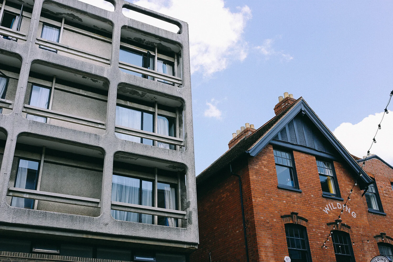
Seems like hardly any of my posts are from London recently... You can't blame me though, can you, as I’ve seen enough of London to last me quite a while in the past 18 months. My friend H, who used to live around the corner from me, moved out of London earlier this year, and I’m so proud of us for managing to see each other about once a month since then. Oxford is a half hour train ride from her house, so on we the train we hopped, to go for an architecture walk in the Jericho neighbourhood. I’m always up for a visit there (still haven’t managed to go to Cambridge - which is crazy)! In fact H was scheming that we should retire there together, listing good healthcare, a smaller city, but still close to London and the countryside as good reasons, to which I added ‘a bikeable city!’. She did get me thinking. Just like in London the architecture is a varied mix - Georgian, Victorian, Brutalist and new. Check out this 60’s student accommodation block out next to, I’m guessing, an Edwardian building, now a very classy wine bar.

ox-2_1500.jpg

And here, a Victorian terrace. I always think streets without trees look so strange.

ox-3_1500.jpg

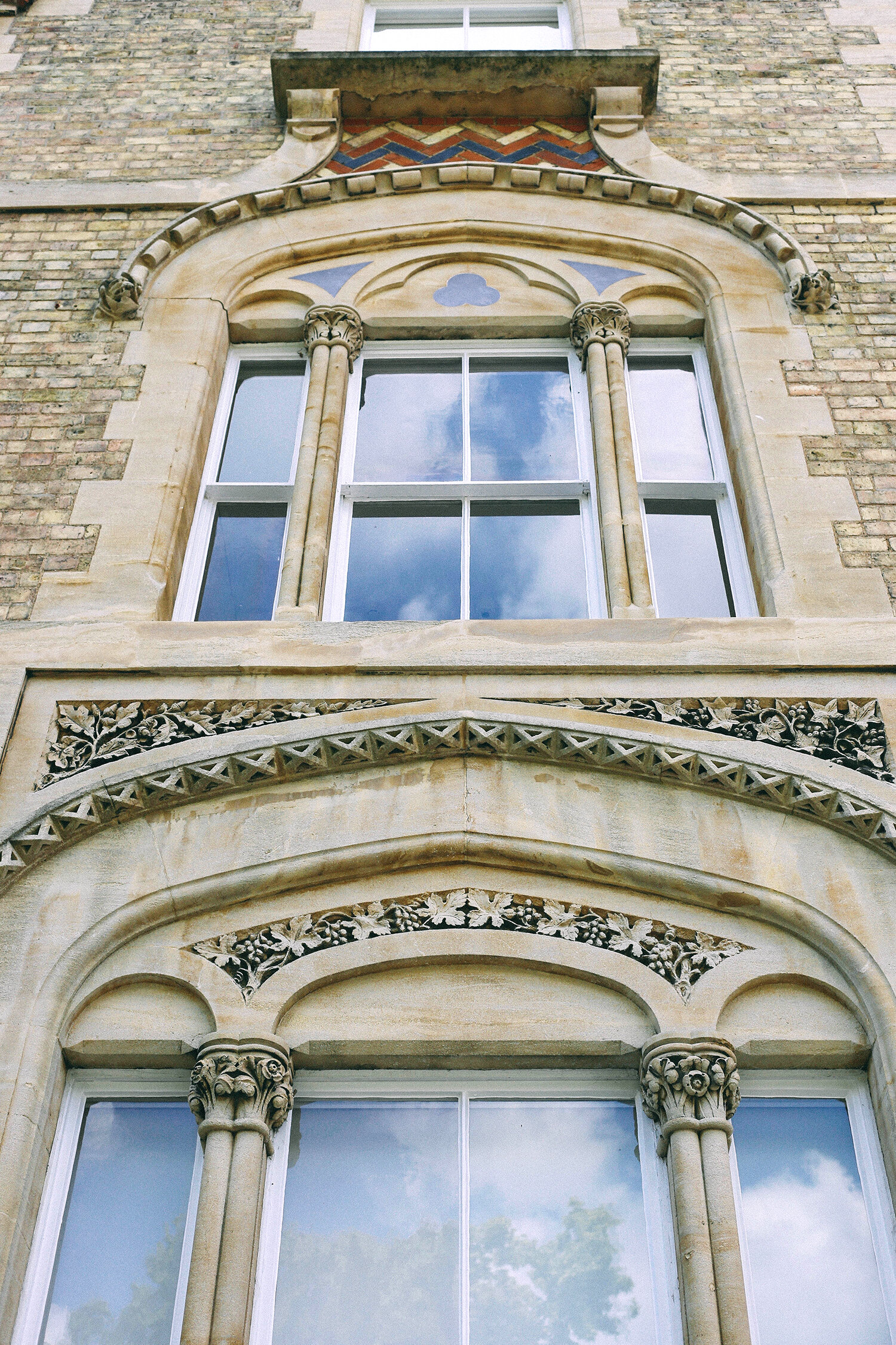
Maybe that’s compensated by these ornate window frames just yards away.

ox-4_1500.jpg

And this Georgian terrace looks very different from London ones, as they’ve been built in what looks like Bath stone, rather than brick.

ox-8_1500.jpg

We all like Georgian houses, don’t we? They really knew how to build proportionally back then. Although if you look closely you can see that this house isn’t perfectly symmetrical.

ox-5_1500.jpg

Had to snap this as I liked the colours and the pattern.

ox-6_1500.jpg

Just around the corner sits another modern student accommodation building. I like how they’ve matched the exterior stone with the older houses.

ox-7_1500.jpg

Look at that cool dining area to the right. Very stylish student digs I must say.

ox-9_1500.jpg

I wanted to get a picture of the Palladian exterior of this building, and cursed loudly about the white van blocking the view. The guy in the picture, who’s van it was, apologised profusely, and I immediately apologised about my outburst. We all had a good laugh about it. The building, St Paul’s, used to be a church and is now a bar called Freud. Funnily enough, I used to frequent the original London branch a lot in the mid 90’s. Oh boy, writing that previous sentence makes me feel old.

ox-10_1500.jpg

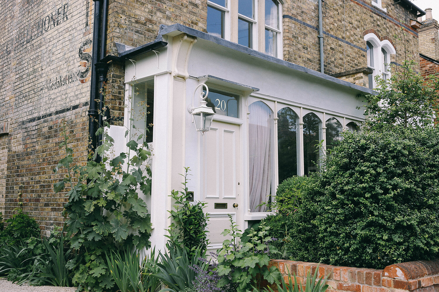
A bit further down the road this house caught our eye. Why did the front look like that, and didn't it look great? Turns out it started out life as a greengrocers.

ox-13_1500.jpg

Hence this old painted ad on the side of the house for Hovis bread.

ox-14_1500.jpg

We stood looking at this house for quite a while. We also really liked the planting. So jealous of people who have the energy to look after their plants that well.

ox-11_1500.jpg

Same road, different style. I love these arched entryways. Something about them is so cosy.

ox-12_1500.jpg

At one point we walked onto a little bridge over the Oxford Canal. I had to take one of my waving at each others reflection pictures there. Here’s another one from Venice.

ox-15_1500.jpg

Face!

ox-16_1500.jpg

In-ter-esting… I wonder if anyone ever does. I didn’t, but maybe I should’ve.

ox-18_1500.jpg

H, looking down a street.

ox-17_1500.jpg

An Oxford alternative to a window box. I don’t think I’ve ever seen one like it before.

ox-19_1500.jpg

Ooooooff. The brick colour and windows on this house. Niiiiiiice.

ox-20_1500.jpg

Before catching the train back to H’s house we walked along Oxford Canal. At one section the houses backed on to it, with the gardens going all the way down to the canal.

Nice, huh?

ox-22_1500.jpg

Talk about lifestyle goals.

ox-24_1500.jpg

Sadly the canal isn’t clean enough to swim in. And also, you’d feel pretty exposed with the opposite side of the canal being a public footpath. Still, really nice to see how some people live (university professors maybe?), and if you wanted to be more private, the gardens were deep enough to shelter you form people like us.

And finally, an eye catching ziggurat tower atop the Saïd Business School right next to the train station. It was so cool to go to Oxford and only walk around one residential neighbourhood and skip everything else. A bit like going to London, only to walk around Islington or something. Lucky us.
Day trippers

hev_1500.jpg

Right at the beginning of the summer holidays Oomoo suggested that we went to back to Hever Castle, bringing our friends C and A with us, and a bloody good idea it was too. Last time we went, three years ago, it was a scorching hot day, but no such luck this year. Heavy rain was forecast for midday, so we headed inside the castle straight after lunch. What’s the back story on this place then? Well, I’ll tell you (hahaha). The oldest part of the castle dates from 1270 (!), but has been added to for centuries, and is most famous as the childhood and family home of Anne Boleyn, King Henry the VIII’s second wife in the early 1500’s. Henry the VIII is probably the UK’s most famous king, what with his six marriages and the initiating the English Reformation. In the end he had Anne Boleyn executed on account of adultery (although it was never proven), and eventually gave Hever Castle to his fourth wife Anne of Cleves, who got away with a bog standard divorce (there’s a rhyme that most English school kids get taught so they remember the fate of the different wives that goes: "Divorced, Beheaded, Died: Divorced, Beheaded, Survived” - nice guy, eh?). Centuries later the wealthy American William Waldorf Astor (the richest man in America at the time) bought the castle and set about to restore it as it had fallen into decline. It’s now owned by a Yorkshire businessman who buys old historical houses and opens them up to the public.

hev-2_1500.jpg

So, let’s head in. Voila, the portcullis. Does it remind you of the Jaws film poster? It does me.

hev-3_1500.jpg

We had to queue for a bit in the courtyard before entering which gave us a chance to have a closer look at the Tudor style exterior of this section.

hev-4_1500.jpg

There’s quite a mish mash of styles in the house, some being more historical and other how the Astors had it. This pictures doesn’t do the room justice (it’s actually sectioned off, so you can’t enter it, and muggins here never has a zoom lens on the camera). It’s a lovely room, with beautiful intarsia wood panelling.

hev-5_1500.jpg

My lovely friend C, taking a pic.

hev-6_1500.jpg

A portrait of Anne Boleyn. I had to take a picture, because as a Swede her surname here made me laugh. Bullen = Bun. Trust me, it’s funnier in Swedish. If you’re 5. Or 46.

hev-9_1500.jpg
hev-7_1500.jpg

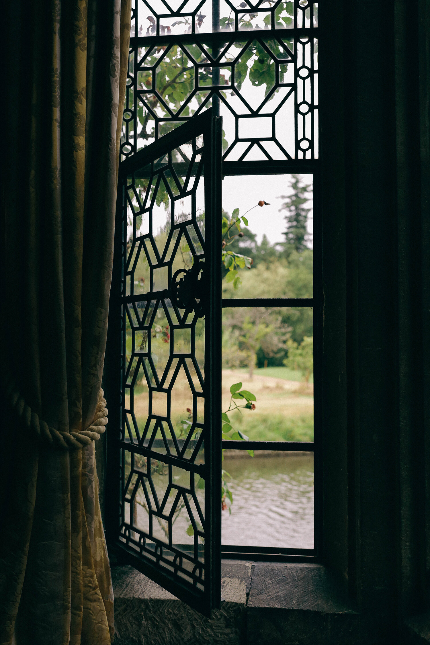
You know I have a window addiction, right? I can’t help it.

hev-10_1500.jpg

A view across to the Astor Wing, or Tudor Village as it’s also called (now a hotel), which was built by Astor and not the Tudors, in 1903, in the Tudor style. Confused yet? Tudor architecture was the architecture du jour during Henry the VII’s reign, that also had a revival in the late 1800’s when it was called Tudor Style or Mock Tudor. If you’ve been to London and to the department store Liberty’s you’ve seen Mock Tudor.

hev-11_1500.jpg

It got a bit busy in this room so I waited a bit so I could get this picture without any 21st century people in it. There was a moment earlier when a kid (8 or 9 years old) freaked out as the guided audio tour had just told him that this room was haunted. The sheer terror in his voice! Poor guy.

hev-12-1500.jpg

As I result of hanging back I missed going into this room with Oomoo, who has a fear of dummies like these. He’s never liked them, so I assume he walked past these guys quickly. This is Henry and Anne innit. And a monstrous hand (there was some sort of trail for younger kids to spot through out the house). Can you spot it?

hev-13_1500.jpg

Some nice light and colours in one of the corridors.

hev-14_1500.jpg

I think my taste is changing as I get older. I never liked this style of painting before, but I like the flatness of them now. I think being forced to look at different styles of art in the past 18 months has broaden my view.

hev-15_1500.jpg

This was once Astor’s daughter’s room, or maybe it was a guest bedroom - I can’t remember.. There was another room next door with flowery wallpaper on the walls, as well as the ceiling, and me and C ohh and ahhed over how much we liked it. C said “It’s happened. We’ve gotten so old we now like chintz”. Yep.

hev-16_1500.jpg

And here we are - the chintz liking ladies.

This room had horrible medieval weapons and torture contraptions in it. This iron mask was worn by women for months or years as punishment for adultery amongst other things, to humiliate and punish them in public. There were loads of different masks, specifically for women, and I asked the guide in the room (male) that it seemed a bit unfair that only the women got punished like this, and the men weren’t. He didn’t like the implication of my comment at all, and proceeded to proudly show us an implement that was used to slice women breasts off. It made me think he had issues with women, and would probably have really enjoyed being a man back then.

And then, the sun came out and so did we. Ciao castle!

hev-20_1500.jpg

Mazes are so a-mazeing. I want them to be larger than the ones I’ve been to - I want to get properly lost. Mr Famapa says there’s an order to how many lefts and rights you should take to make your way out without hitting a dead end, so walking them with him is always a quick experience. And here there was, once we got to the middle of it, a straight line out to the exit - which was a cheat.

hev-21_1500.jpg

Edgy hedge.

hev-22_1500.jpg

Piggy hedge.

hev-23_1500.jpg

I like the wildflower meadow planting that we’re all realising is good to have now.

hev-24_1500.jpg

At Hever there is also a water maze, which you walk through trying not to get wet if you’re an adult, and the opposite if you’re not. The maze is a circular stone tile walkway that sprays water if you step on the 'wrong’ tile. For some reason I didn't bring spare clothes for Oomoo (even though we’d been before), so he had to sit in the car for the two hour drive home afterwards completely drenched.

hev-25_1500.jpg
hev-26_1500.jpg

More nice planting.

hev-27_1500.jpg

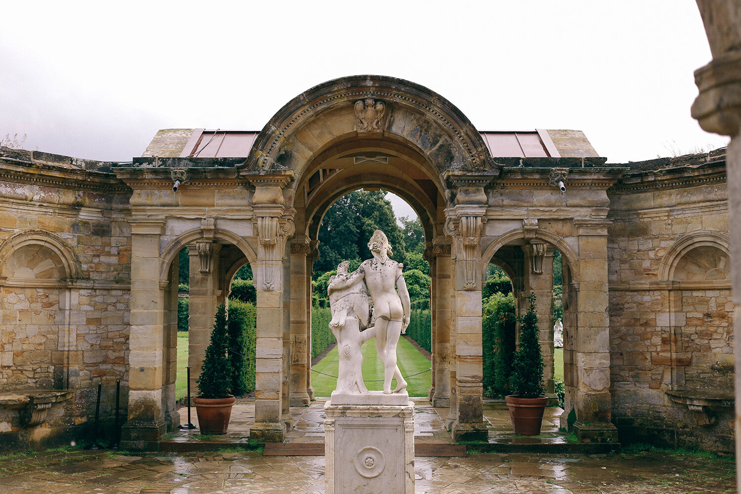
Best mates statue alert. I love how they’re just hanging out, having a chat.

hev-28_1500.jpg

Let’s see it from the front. It looks like the eagle is telling his pal about the time he accidentally ate a grumpy male guide in the castle 😉.

o_1500.jpg

This is what a lot of summer in the UK 2021 looked like - April in other words. I’m so glad we ignored the weather forecast and just went anyway. If you’re looking for a day out outside London I say GO; I thought I wouldn’t enjoy it as much the second time, but I was pleasantly surprised. And if we hadn’t gone on a rainy day I wouldn’t have got this shot, and that would’ve been a shame.

Clever lady

perri_1500.jpg

Oh hello! How’s tricks? As is always the case in September, I have a long backlog of pictures from the summer to post. I managed to cram in a lot of culture as it’s pretty much my oxygen, you know? And with winter looming and who knows what, I just wanted to take advantage of things being open. Luckily there’s been a lot of good stuff to see. Me and my fellow culture vulture D went to see the Charlotte Perriand exhibition at the Design Museum last month and were seriously impressed by the seriously impressive Perriand. I have to be honest here, these exhibition posts are so time consuming to write as I want to try and share info about said artist/architect/creative, but it does mean that it can take a really long time before I’m ready to press the publish button. Do you guys find this stuff interesting or am I making things unnecessarily harder for myself? Feedback would be very much appreciated! In the meantime I’m going to cheat, and you can read up more on Charlotte Perriand here.

perri-2_1500.jpg

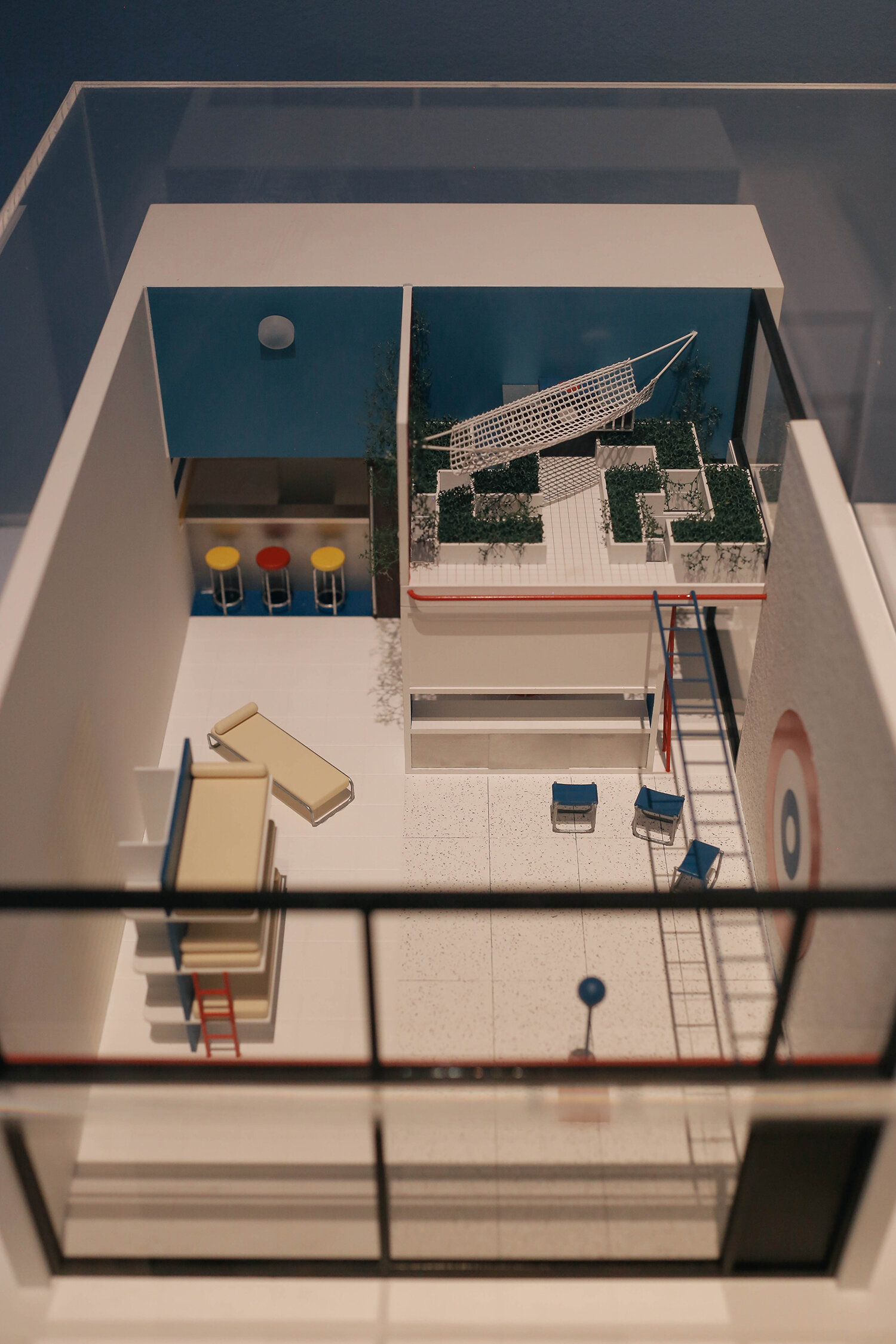
Still, I guess I have to explain a bit about her here so this post makes sense. So, Perriand was a French designer and architect who was a part of the Modernist movement working from the 1920’s until the end of the 1990’s (!). She applied for work at the Le Corbusier Studio only to be told by the big man himself: "We don’t embroider cushions here.” (insert massive eye roll). But a year later, having seen her installation at Le Salon d’Automne in 1927, where she had recreated the bar area in her own apartment showing her furniture designs (a bit like in the first picture), Le Corbusier asked her to join his studio on the spot (in your face LC!). She, together with Pierre Jeanneret, went on to design the furniture to go with Le Corbuisier’s houses, who was horrified by seeing how his clients would fill his Modernist houses with antique furniture. The gall!

new_perri_1500.jpg

It was clear that these designs would fit the interiors much better.

perri-3_1500.jpg

Maybe you recognise this design of this chair, the Fauteuil Grand Confort? A Perriand classic, that Le Corbusier and Jeanneret got credited for designing, when it actually was all her work alone. Isn’t patriarchy just great?

perri-5_1500.jpg

And here D is trying out a replica IRL. It’s well comfy. And those colours are just delicious. Putting tubular steel on the outside of the seat was a groundbreaking design at the time.

new_perri-2_1500.jpg

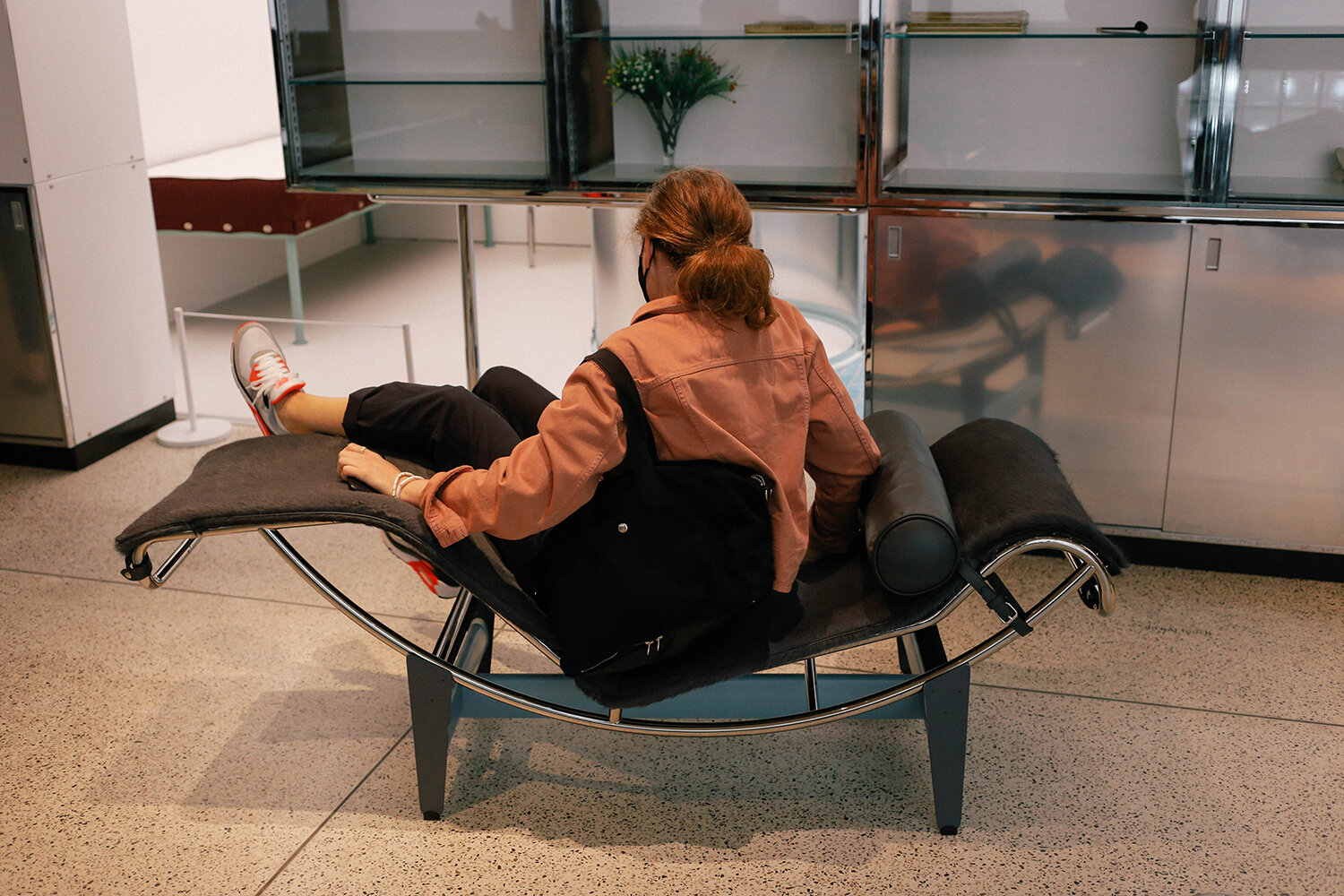
The Chaise Longue Basculante is such a great design; you can lift the seat section up and angle it however you like. Also very comfy, but hard to get out of gracefully, at least at this angle.

1new_perri_1500.jpg

It wasn’t clear in this section of the exhibition that this was a replica of an single room apartment that Le Corbusier, Perriand and Jeanneret presented as an installation at the 1929 Salon d’Automne. This was the open plan section looking one way (I didn’t take a pic of the reverse view with the dining area, I thought this was just a section with furniture on show - put together badly 😂). The bathroom and kitchen section is behind the storage units on the left of this picture.

perri-4_1500.jpg

Sterile, n’est pas? It’s crazy to think this was designed nearly 100 years ago. Those guys were so influential, and it’s even crazier to think that architecture and interiors haven’t moved on that much from the Modernist movement. Although personally I’d never choose to sleep right next to the bathroom sink.

perri-6_1500.jpg

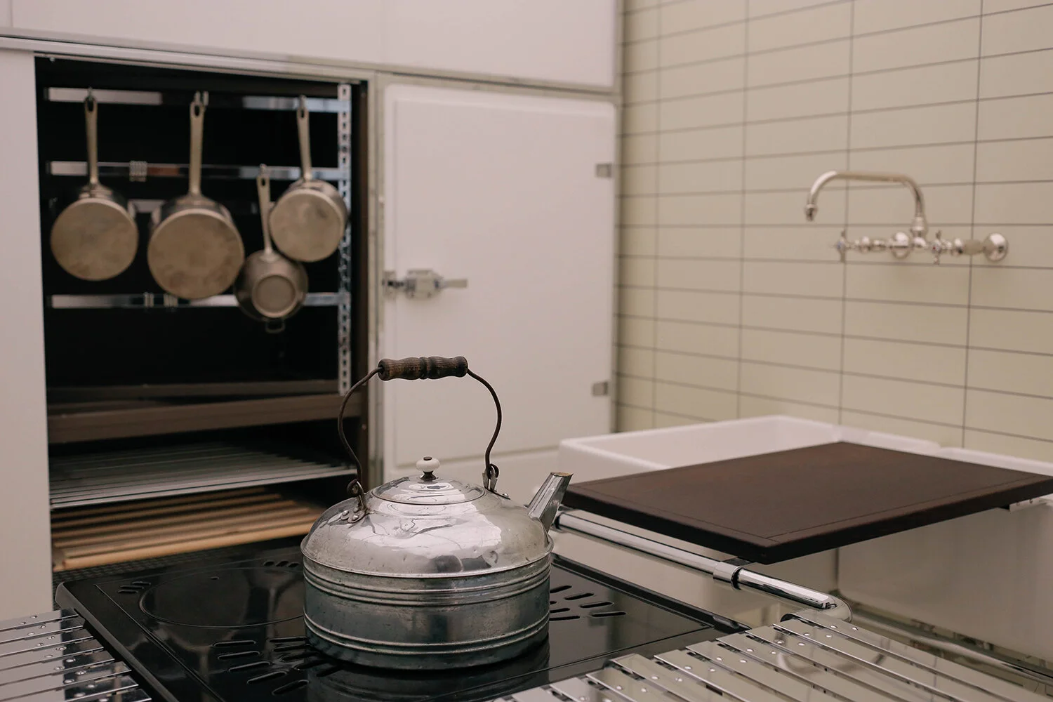
On the other side of the wall at the back of the picture above was the kitchen. Apologies for not taking a wide shot here.

perri-7_1500.jpg

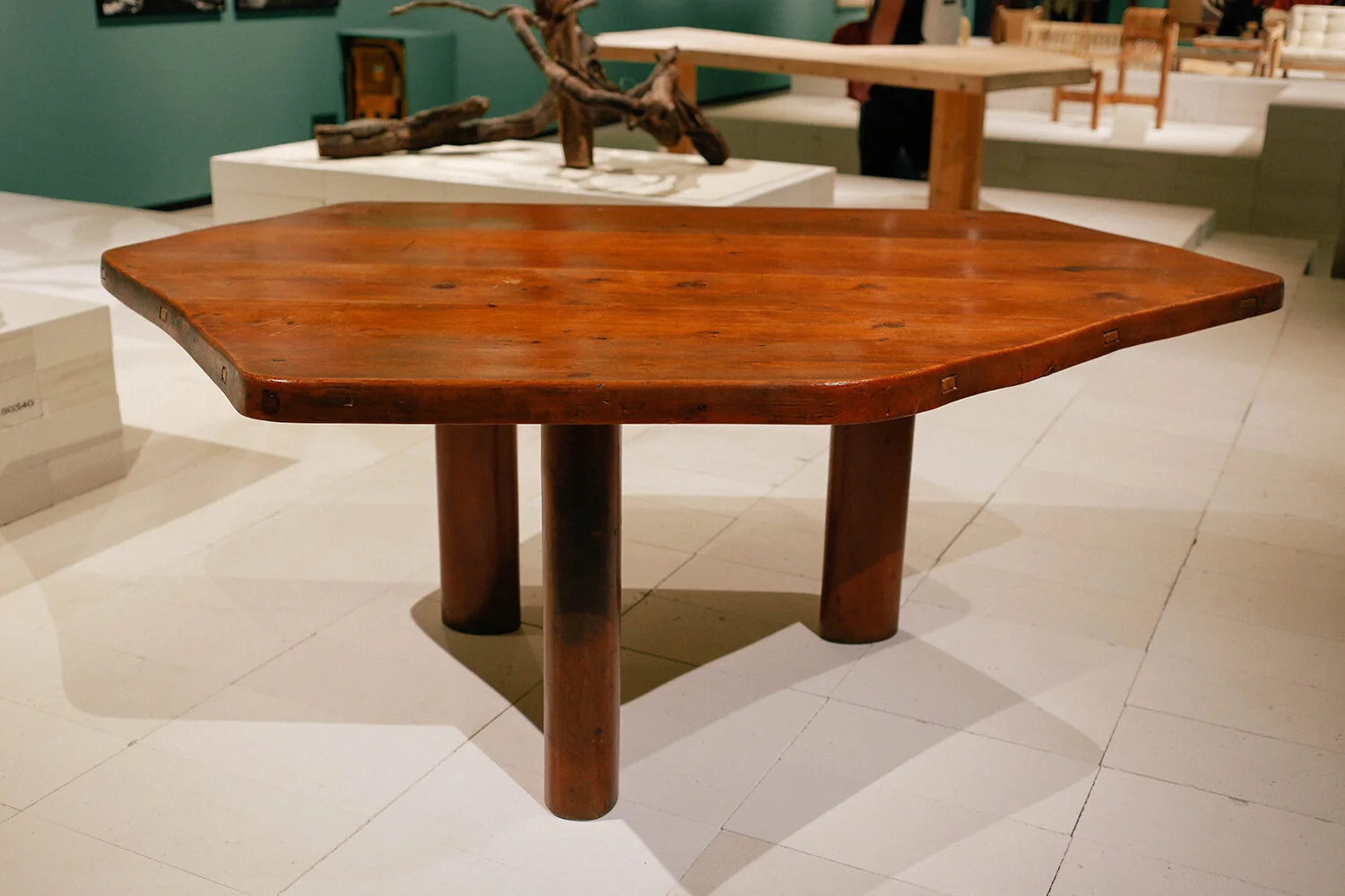
I loved this picture from Perriand’s studio in Montparnasse. It just looks so damn cosy. Towards the late 1930’s she turned away from metal manufacturing and started working almost exclusively with wood. She designed the table in that shape as it let you seat more people comfortably than you could do with a rectangular or square table. So clever. Perriand was also very sporty Spice, hence the still rings in the ceiling.

new_perri-3_1500.jpg

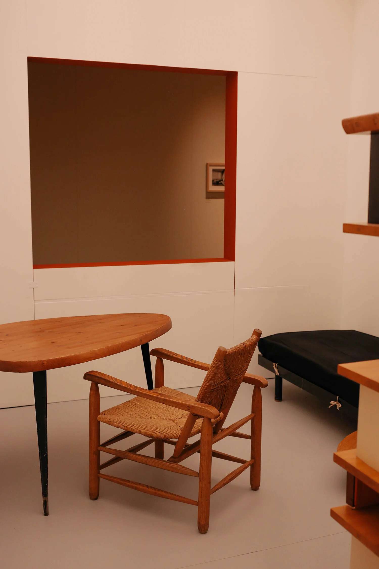
An example of the table in the exhibition, clearly showing how the design of the table legs meant that they weren’t in the way of guests’ legs (I hate when you have to sit with your legs around table legs).

perri-8_1500.jpg

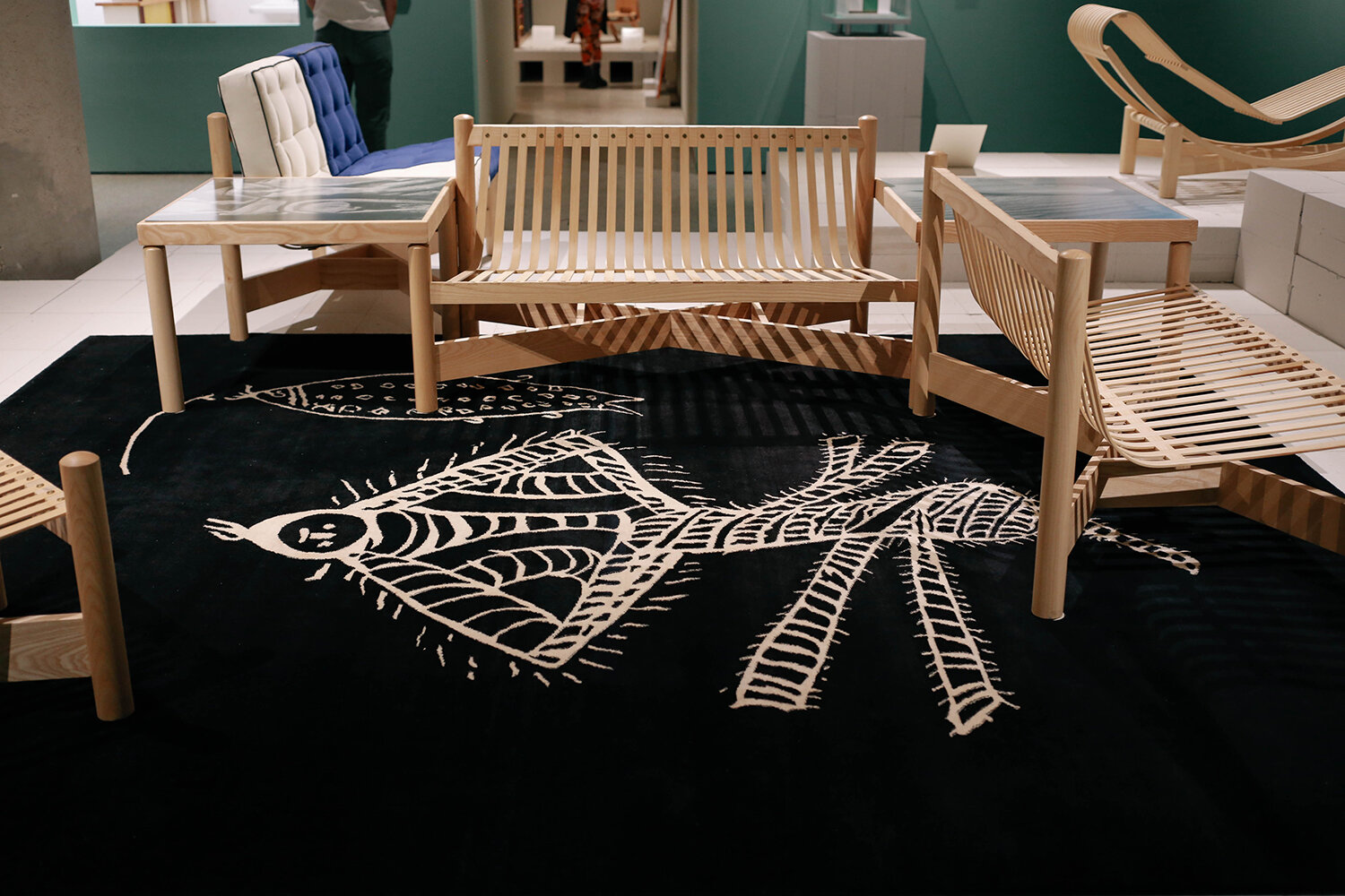
During WW2 she was invited to go and work in Japan, and on the ship on the way over there she spotted this chalk graffiti on the deck, drawn by a Japanese sailor, which impressed her so much…

perri-9_1500.jpg

… that she copied it and enlarged it onto a rug design. As you can see here, her furniture designs had taken on a much more organic form by the early 1940’s.

perri-10_1500.jpg

Love this picture of her messing about.

perri-12_1500.jpg

Some very cool wall lights that you could pivot the angle on. They gave off such a nice light.

perri-11_1500.jpg

And this chair! Wouldn't mind having a couple of them in the house (I wish 💸).

perri-13_1500.jpg

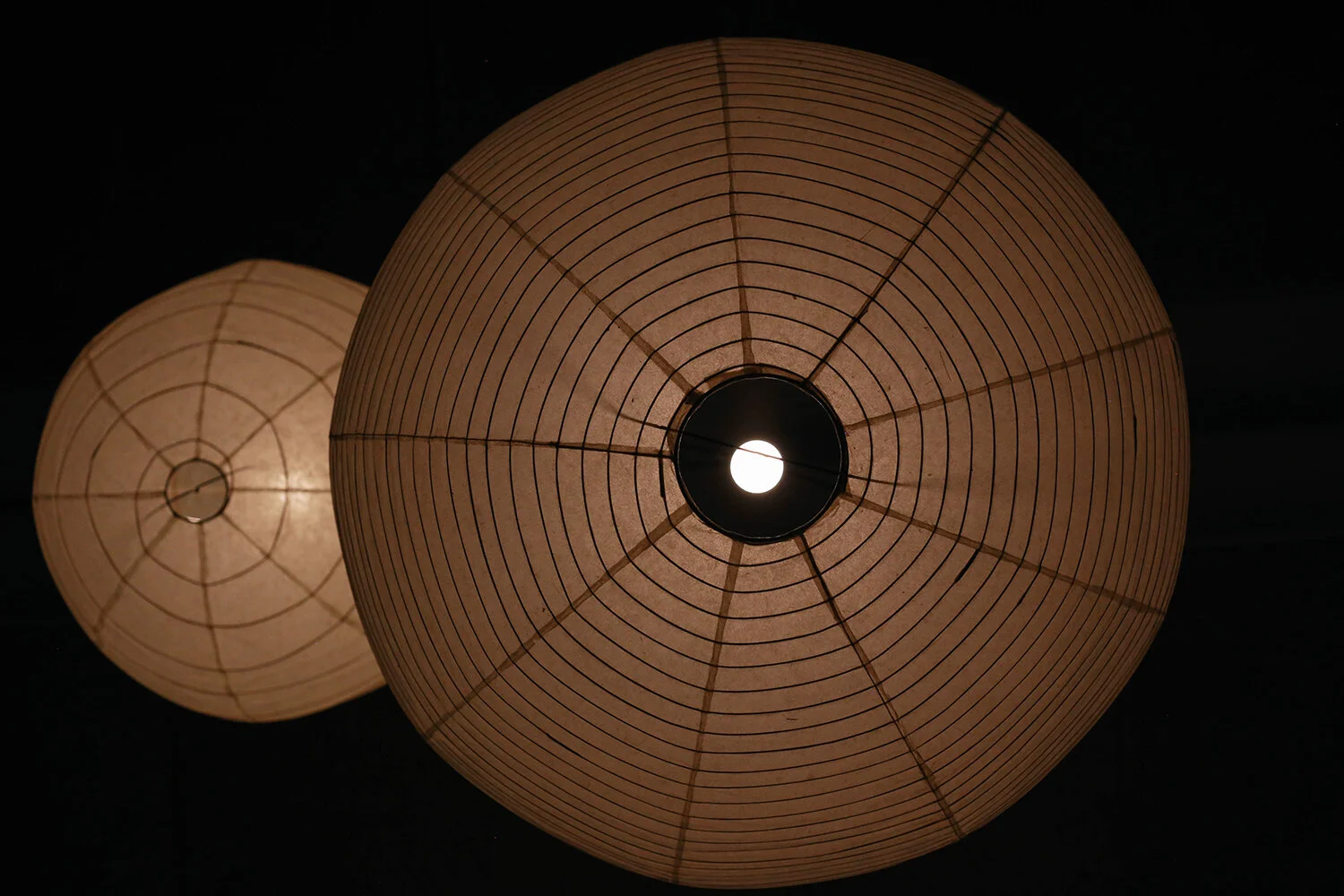
Some Isamu Noguchi rice lamps - from below. Very much looking forward to seeing his exhibition at the Barbican this autumn.

perri-14_1500.jpg

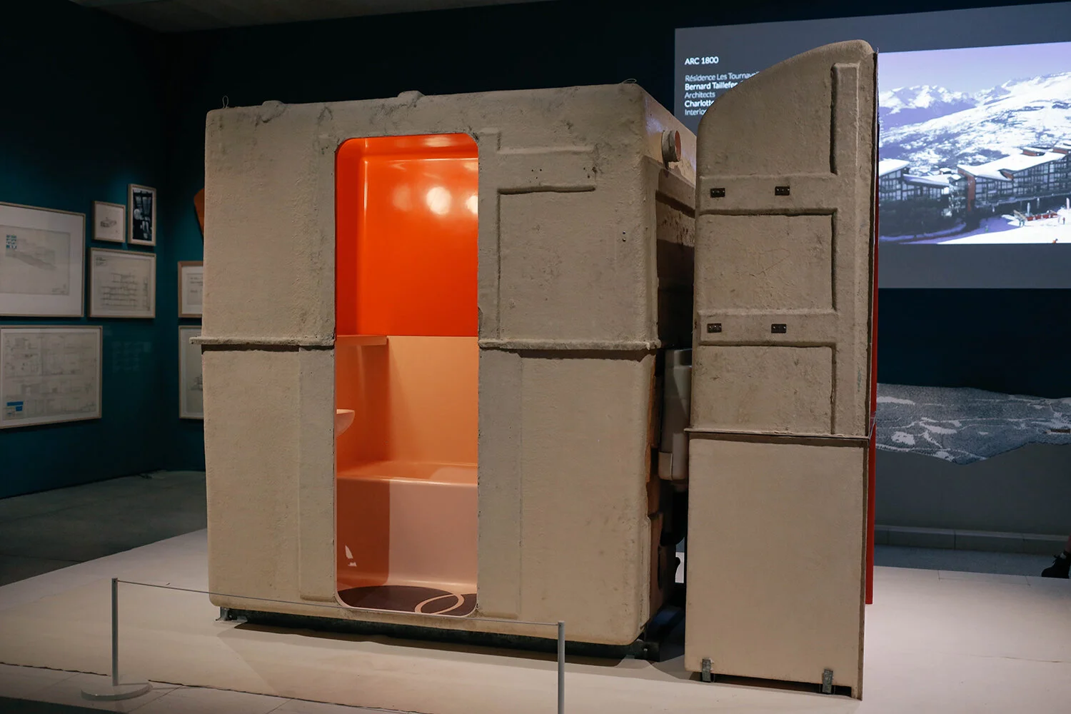
Looking at my pictures now, I realise I skipped so much as I wasn't intending to take pictures of everything to show what was there - here. I just took pics of what I liked the look of. So apologies for an abbreviated representation of all of this. So what is this you may wonder? Well, Perriand designed the ski resorts of Les Arcs 1600, 1800, 1950 and 2000 in the late 1960’s and 70’s. She had the kitchen and bathrooms prefabricated off site, so that they could be craned into position with all the electrics and plumbing all ready to be plugged in. Here’s the kitchen section

perri-15_1500.jpg

and here you can see the bathroom part in it’s own box. I found this film on YouTube that explains a bit more.

Charlotte Perriand was a genius designer and architect, and by the looks of things a great human being too. In her later years she built herself a small chalet in Meribel, and it was my favourite of all the things she created. There were only photographs of it in the exhibition, but have a look here and you’ll see what I mean. So happy we got to find out more about her and her work; I resent how history has always airbrushed women out if it, unless they were royals. Stupid frickin’ patriarchy.