Screen time

There weren’t many good exhibitions on in Amsterdam when we were there, which was a bit of a surprise. After the lockdowns the quality of exhibitions in London have been phenomenal (I must have about 10 of them that I need to post about - if not more), so I guess I’ve been spoilt. But through googling what was near us I found a link to Nxt Museum, a new media art gallery that looked enticing. Their inaugural exhibition, Shifting Proximities (on until May 8th) didn’t disappoint. I was really looking forward to the installation above by UVA, but was a bit underwhelmed. I’ve seen their work in London before and it’s always been amazing.

We really enjoyed Habitat by Heleen Blanken though, which you might be able to make out by Z’s smile here if you look closely enough.

So dream like.

Can’t remember who this is by. Looks good though, innit.

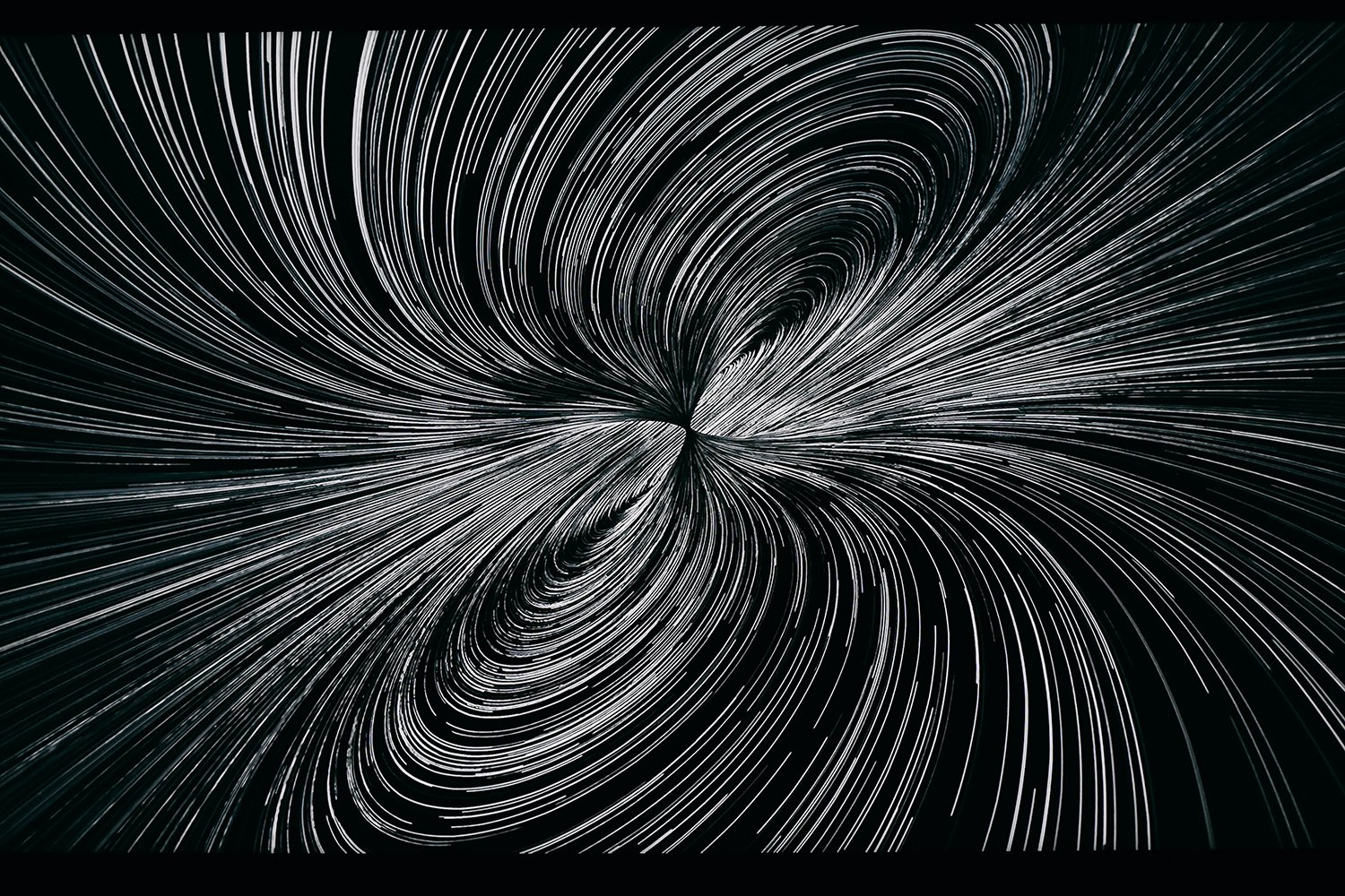
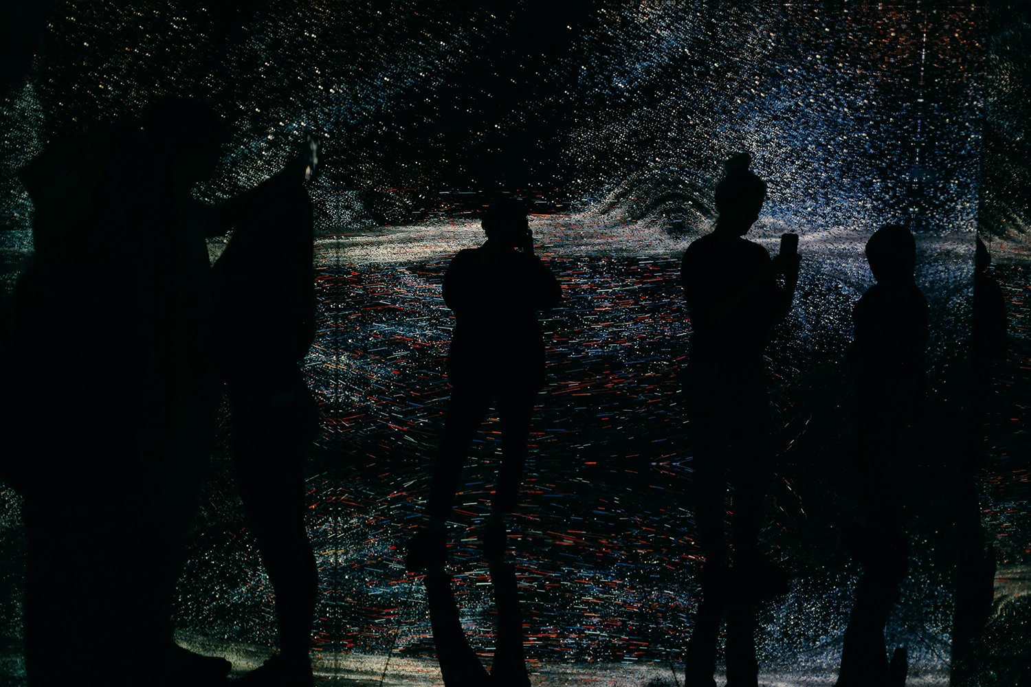
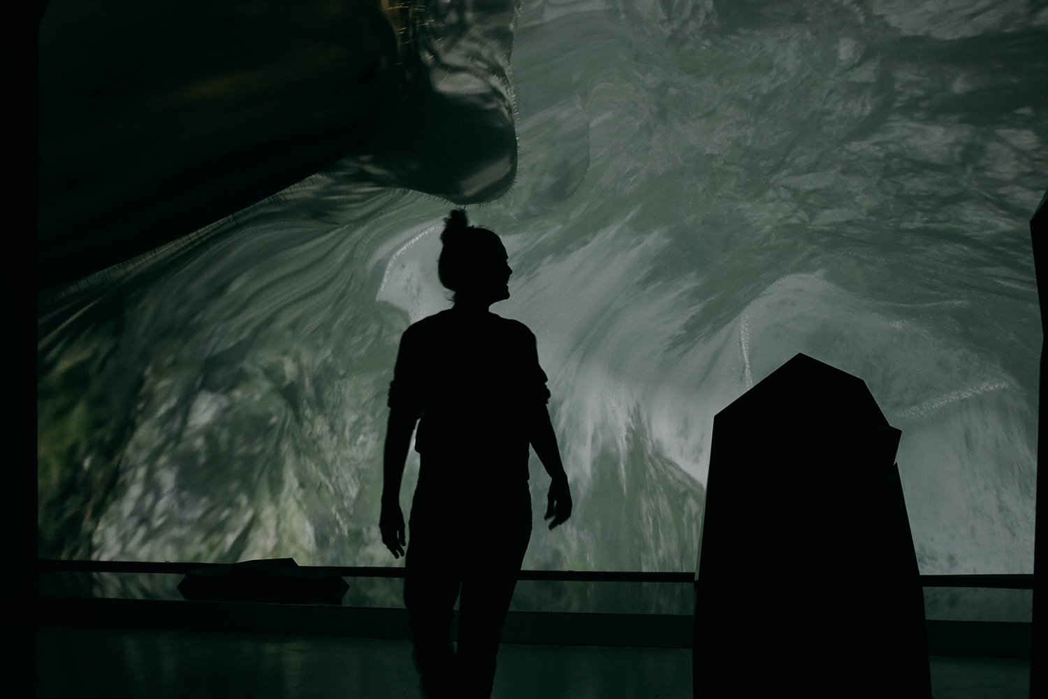
I haven’t seen the work by Marshmallow Laser Feast before, and their Distortions in Spacetime was my favourite. It’s projected in a mirrored box, so you have to put on shoe socks on before you go in, and once you do you’re immersed in a 360 degree installation.

It worked like digital confetti in Z’s hair.

You might wonder what this is all about? Well, I’ll copy and paste from the website for ya: “In a giant star’s final moments, atoms compress to a point where density becomes infinite, time stretches to a stop and the gravitational field is so strong that not even light can escape: a black hole. But the force that creates this dark shadow also spews out a supernova explosion of matter that can eventually coalesce to form planets, plants and people. In Distortions in Spacetime, visitors will see themselves reflected in this matter and will begin to understand the cosmic connection between black holes, dying stars and our very existence.”

Makes your head hurt doesn’t it? Aside from the impossibility of it, don’t you think that if all humans got the chance to travel out into space and saw the vastness of it all, as well as our own little planet in it, we would behave better towards each other and our planet? We could really benefit from such a change of perspective.

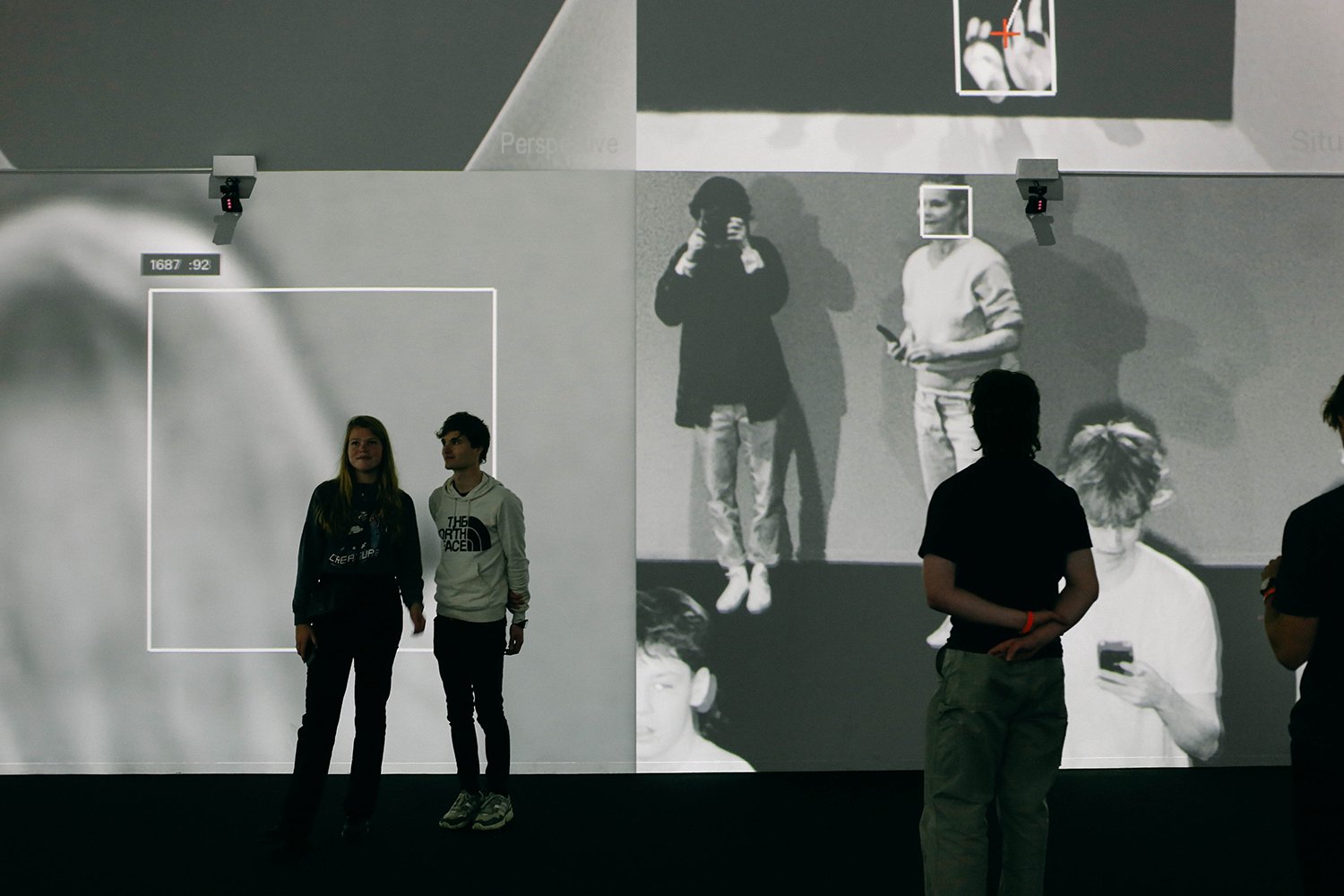
Anyway. Back to the art. This massive room with CCTV cameras was quite something. Crazy to think how ubiquitous surveillance is now, and how much information we happily give away about ourselves without thinking.

Lastly, Yuxi Cao’s Dimensional Sampling felt very familiar to Ryori Ikeda’s work (you can see my pictures from Ikeda’s London exhibition last year in this blogpost), but was nowhere near as good. Ah well, no matter. We thoroughly enjoyed being taken somewhere else completely for a little while.

A Fri-yay

fri_1500.jpg

Time to jump forward in time a bit, to Friday a couple of weeks ago, which is still back in time, but not as far back as all my recent posts. D & G, my old work friends, both had the day off, so we decided that we should have a day of culture. We were to spend the day in East London, and D showed me this crazy looking building she had spotted the evening before. And having just googled it I’ve learnt that it’s Nobu Hotel. How very swish. The actual rooms look nowhere near as interesting as the outside though.

fri-3_1500.jpg

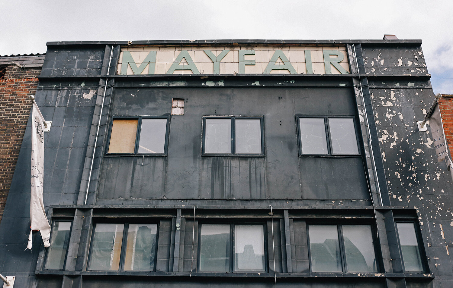
Walking down Brick Lane we walked past this building and the tiled ‘Mayfair’ caught my eye. “Must’ve been a cinema back in the day” thought D. She was right.

fri-4_1500.jpg

This fool knew that we were going to a gallery and on to other things, but I needed to do a bit of ‘getting ready for winter’ shopping, so I felt a bit like a pack mule with my two bags (you can only see the shoulder strap of the other one here). I also dressed way too warm for the day, in fact just remembering that has given me a hot flush this very second…

fri-5_1500.jpg

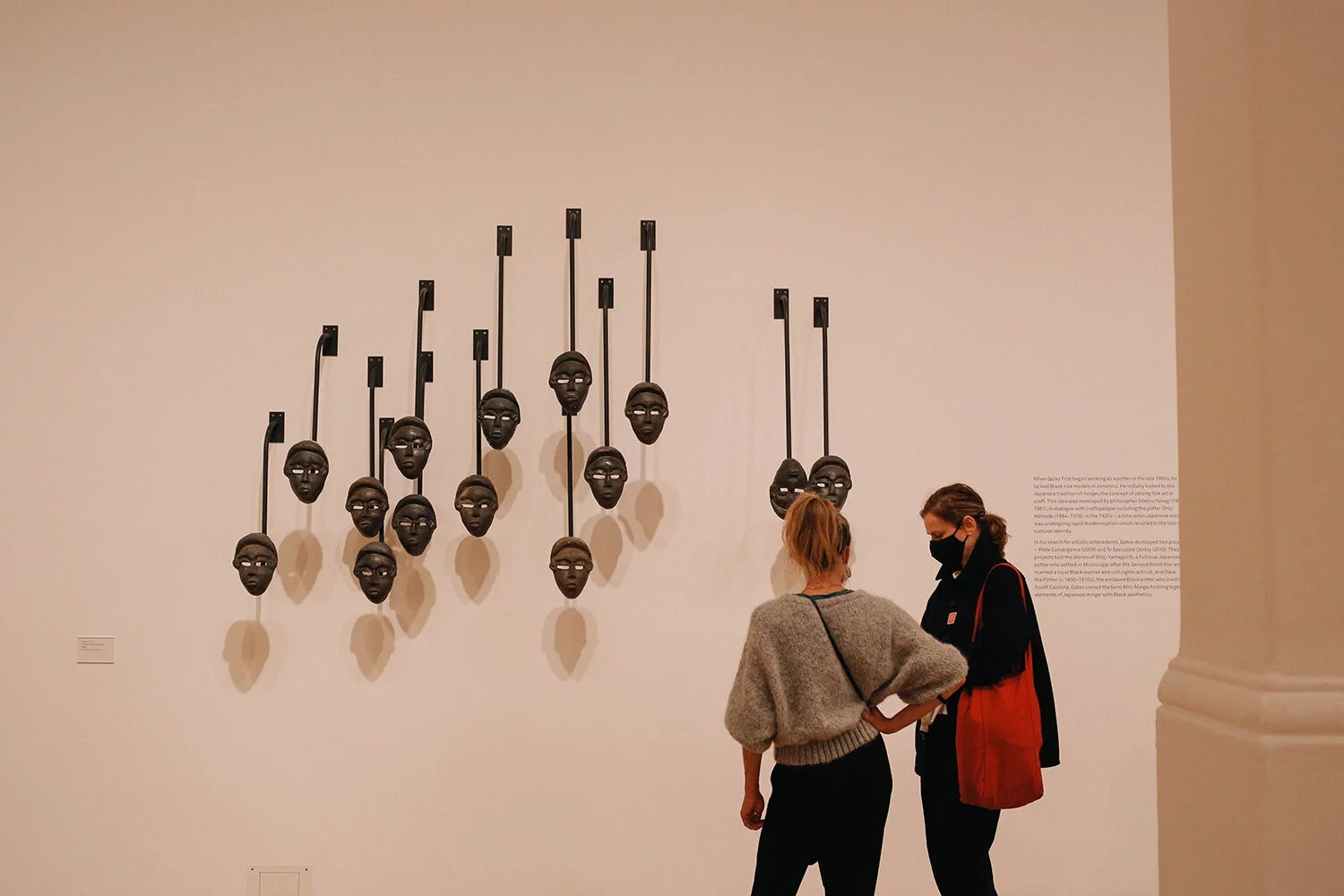
Soooooo, we went to Whitechapel Gallery to see the Theaster Gates exhibition and great it was too. The initial exhibits where a selection from the ceramic collection at the V&A that Gates had chosen for the exhibition.

fri-6_1500.jpg

An amazing looking tool that Gates makes bricks with. It almost looked like a sculpture. I guess you could argue that if you put any object in a gallery, it looks like a sculpture.

fri-7_1500.jpg

D’s friend K came with us too, and here they both are, not looking at what was in front of them at all, haha.

fri-8_1500.jpg

Walking up to the second floor of the exhibition we had to try out this ‘social sculpture’ (not by Gates, can’t remember who it was by), which was built so whenever people sat in there, their knees would touch.

fri-9_1500.jpg

From two ladies with knees touching to two heads with necks joined together. I’ve wanted to see Theaster Gates’ art for a while now after having read about him in Will Gompertz book ‘Think like an artist’. Gates has over the years put the money that he has made from selling his art back into the community in Chicago’s South Side, where he lives. He’s been buying up derelict properties, turning them into cultural community spaces for everyone, but in particular for local residents. You can watch these YouTube videos and find out more here and here. I really admire his way of thinking, and all that he’s done.

fri-10_1500.jpg

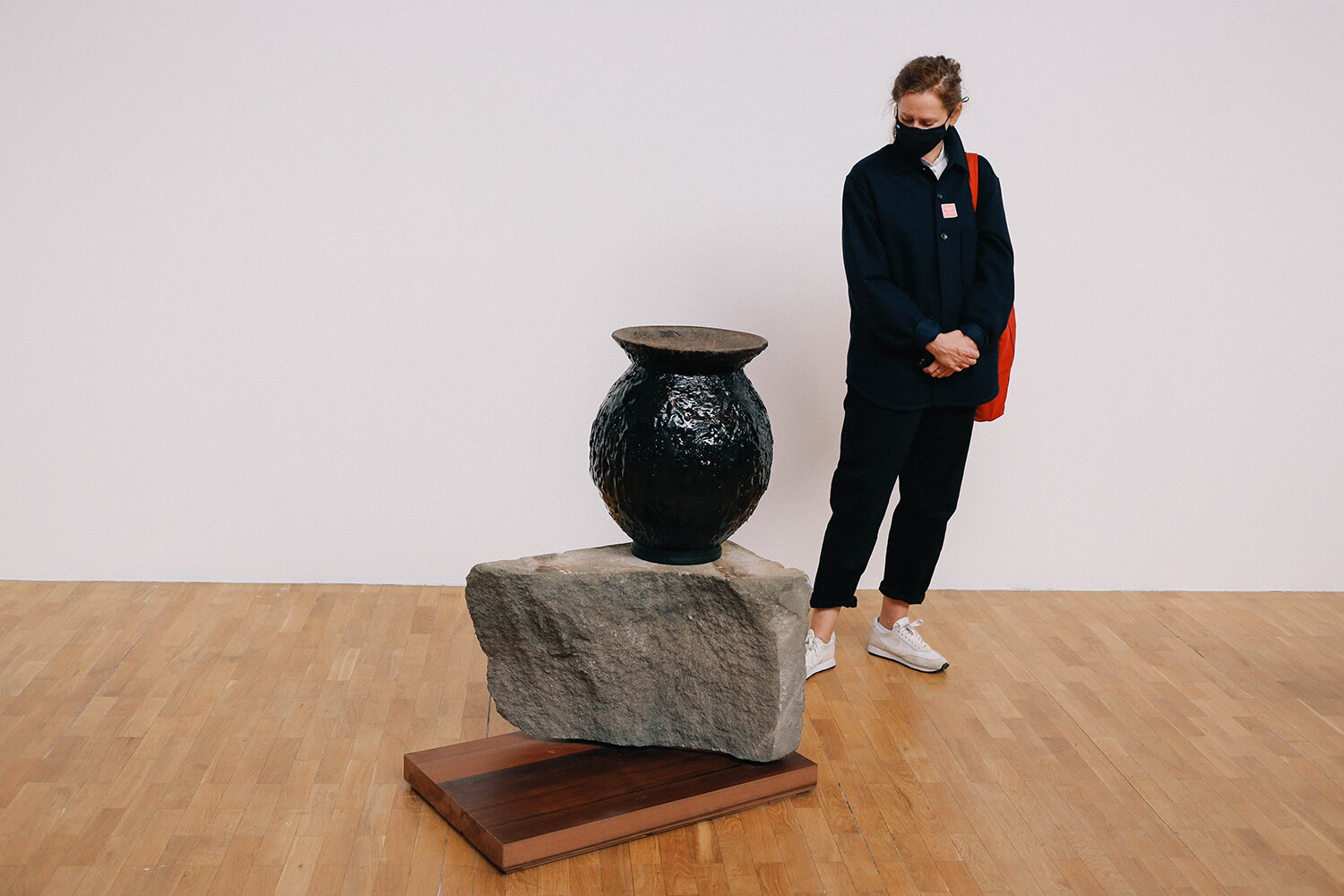
So let’s look at some of what pays for his community projects. These pots had been glazed or covered in tar, and the inside was filled up with it too. The scent as you stuck your nose in it was tar-iffic.

fri-11_1500.jpg

So many cool huge ceramic objects in this room. We were really in awe.

fri-13_1500.jpg

Finished with the exhibition, we walked down the road to catch the overground. I had to excuse myself at one point to walk over to take this.

fri-14_1500.jpg

And seeing this guy squashed against a shop window like this made me very happy.

fri-15_1500.jpg

We got off the train in Haggerston and walked along Regent’s Canal.

fri-16_1500.jpg

And around Broadway Market for a little bit, in search for a something hot to drink and sweet to eat. This place didn't make the cut, but had great light.

fri-17_1500.jpg

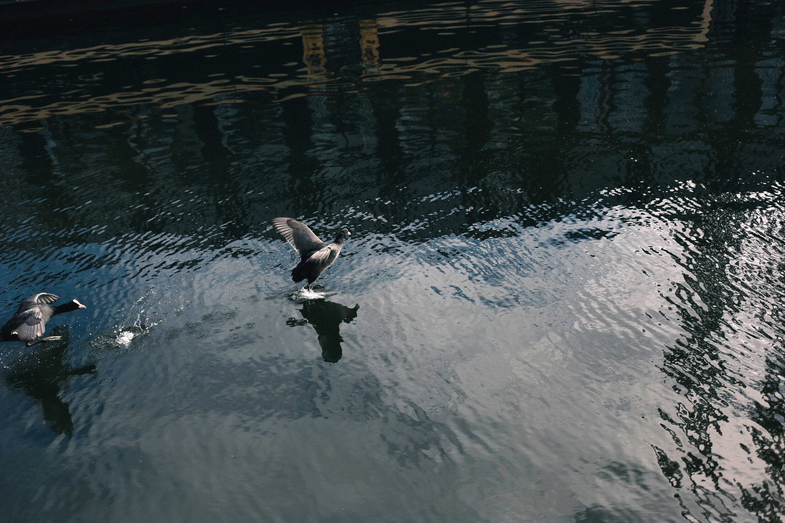
Bellies full, we walked back along the canal, and these coots seemed to be squabbling over something.

fri-18_1500.jpg

“Run Forrest, run!”

fri-19_1500.jpg

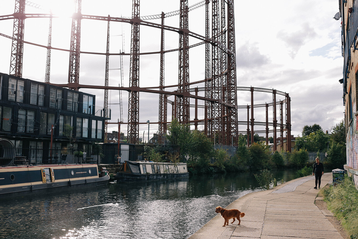
This little doggie just missed the action.

fri-20_1500.jpg

G, K and D, ahead of me - rhymes yo.

fri-21_1500.jpg

Canal abstract. We were actually walking to our next cultural stop of the day, but that’s a whole post of its own.

fri-22_1500.jpg

All in all, a great day, where we felt like we were on holiday, doing only nice things as one does when away. Even just waiting for the train back home looked good.

Clever lady

perri_1500.jpg

Oh hello! How’s tricks? As is always the case in September, I have a long backlog of pictures from the summer to post. I managed to cram in a lot of culture as it’s pretty much my oxygen, you know? And with winter looming and who knows what, I just wanted to take advantage of things being open. Luckily there’s been a lot of good stuff to see. Me and my fellow culture vulture D went to see the Charlotte Perriand exhibition at the Design Museum last month and were seriously impressed by the seriously impressive Perriand. I have to be honest here, these exhibition posts are so time consuming to write as I want to try and share info about said artist/architect/creative, but it does mean that it can take a really long time before I’m ready to press the publish button. Do you guys find this stuff interesting or am I making things unnecessarily harder for myself? Feedback would be very much appreciated! In the meantime I’m going to cheat, and you can read up more on Charlotte Perriand here.

perri-2_1500.jpg

Still, I guess I have to explain a bit about her here so this post makes sense. So, Perriand was a French designer and architect who was a part of the Modernist movement working from the 1920’s until the end of the 1990’s (!). She applied for work at the Le Corbusier Studio only to be told by the big man himself: "We don’t embroider cushions here.” (insert massive eye roll). But a year later, having seen her installation at Le Salon d’Automne in 1927, where she had recreated the bar area in her own apartment showing her furniture designs (a bit like in the first picture), Le Corbusier asked her to join his studio on the spot (in your face LC!). She, together with Pierre Jeanneret, went on to design the furniture to go with Le Corbuisier’s houses, who was horrified by seeing how his clients would fill his Modernist houses with antique furniture. The gall!

new_perri_1500.jpg

It was clear that these designs would fit the interiors much better.

perri-3_1500.jpg

Maybe you recognise this design of this chair, the Fauteuil Grand Confort? A Perriand classic, that Le Corbusier and Jeanneret got credited for designing, when it actually was all her work alone. Isn’t patriarchy just great?

perri-5_1500.jpg

And here D is trying out a replica IRL. It’s well comfy. And those colours are just delicious. Putting tubular steel on the outside of the seat was a groundbreaking design at the time.

new_perri-2_1500.jpg

The Chaise Longue Basculante is such a great design; you can lift the seat section up and angle it however you like. Also very comfy, but hard to get out of gracefully, at least at this angle.
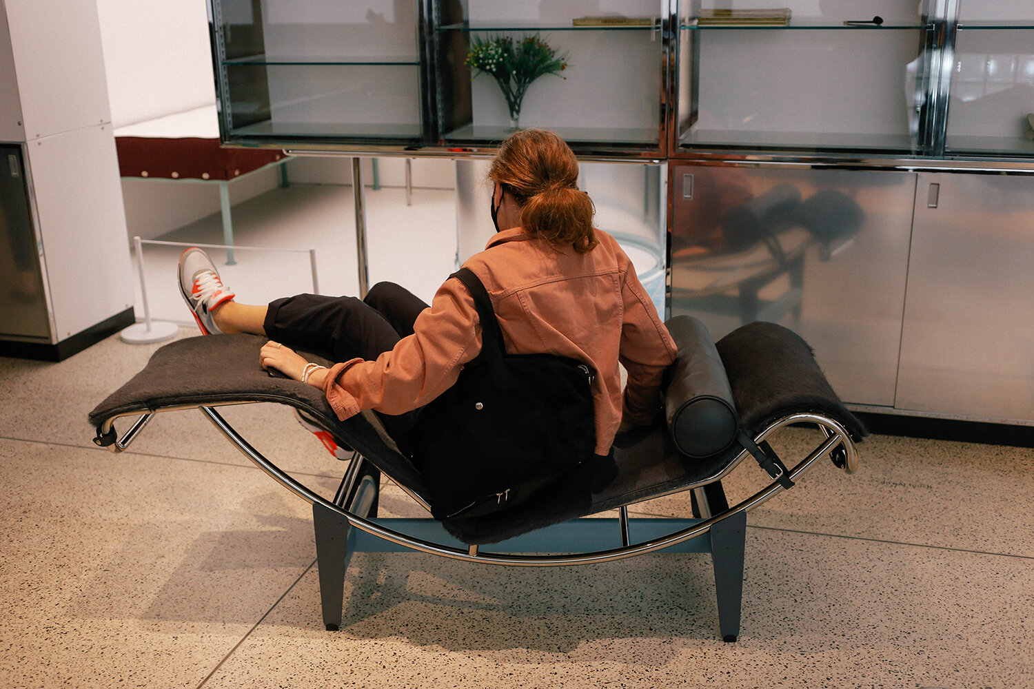
1new_perri_1500.jpg

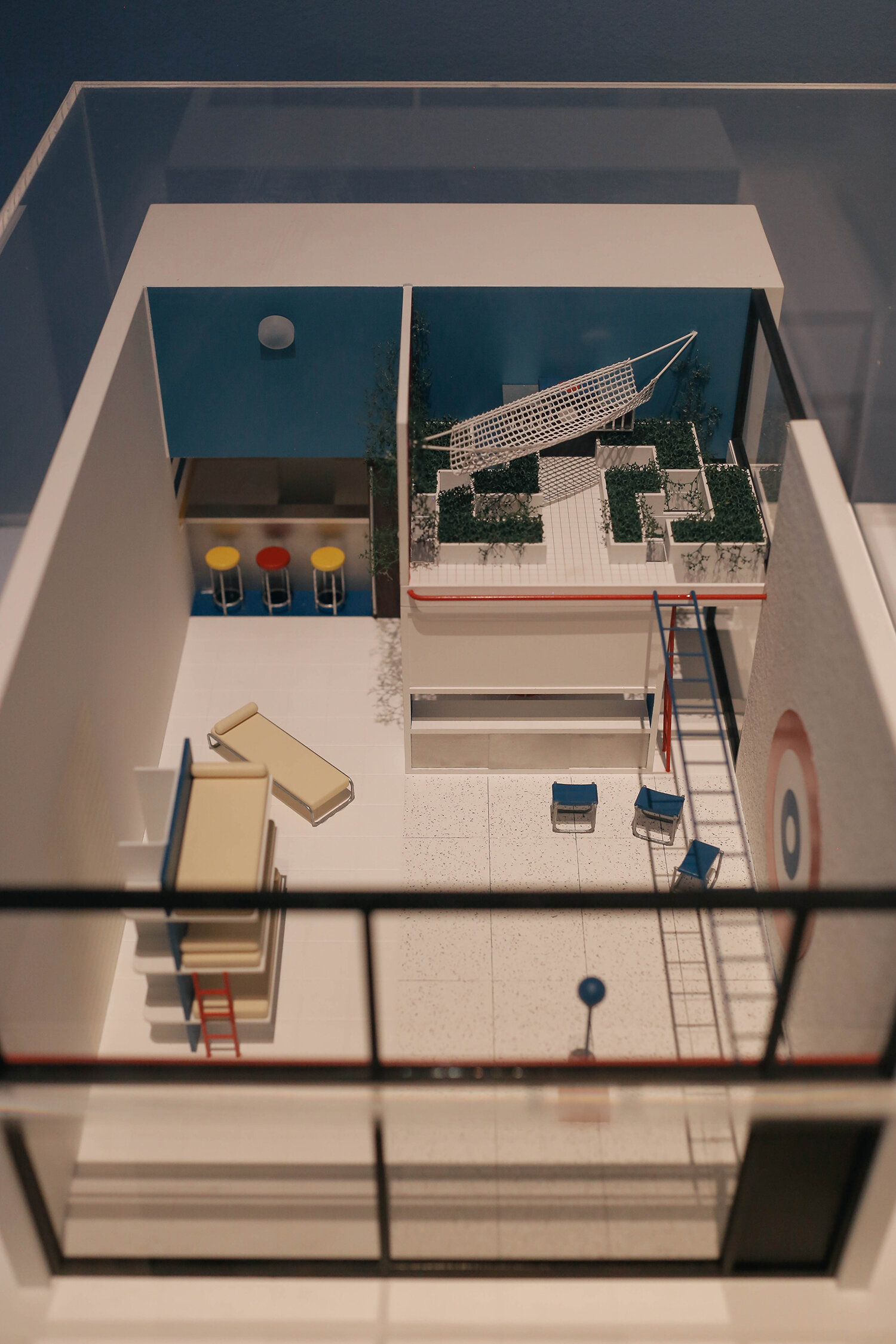
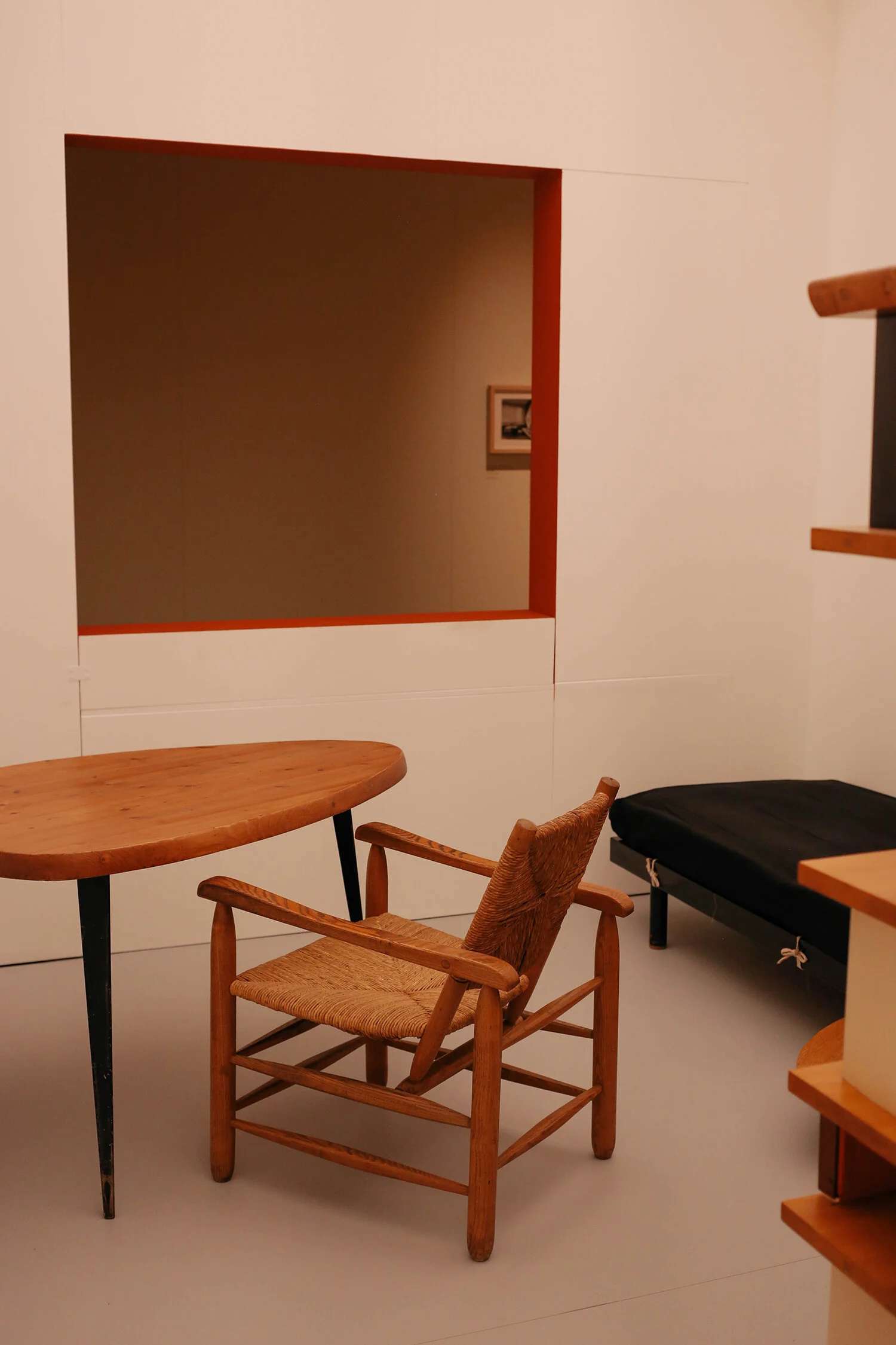
It wasn’t clear in this section of the exhibition that this was a replica of an single room apartment that Le Corbusier, Perriand and Jeanneret presented as an installation at the 1929 Salon d’Automne. This was the open plan section looking one way (I didn’t take a pic of the reverse view with the dining area, I thought this was just a section with furniture on show - put together badly 😂). The bathroom and kitchen section is behind the storage units on the left of this picture.

perri-4_1500.jpg

Sterile, n’est pas? It’s crazy to think this was designed nearly 100 years ago. Those guys were so influential, and it’s even crazier to think that architecture and interiors haven’t moved on that much from the Modernist movement. Although personally I’d never choose to sleep right next to the bathroom sink.

perri-6_1500.jpg

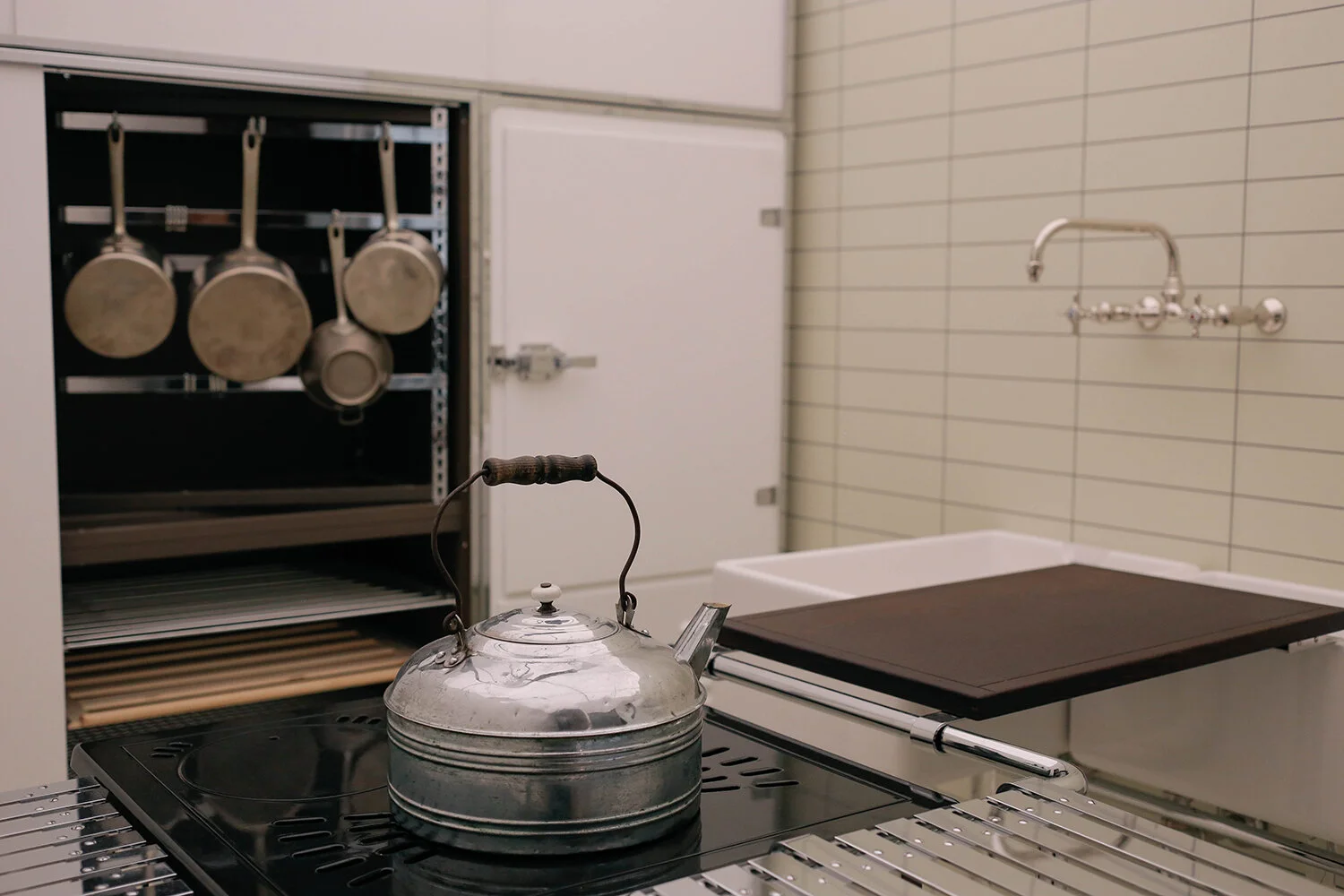
On the other side of the wall at the back of the picture above was the kitchen. Apologies for not taking a wide shot here.

perri-7_1500.jpg

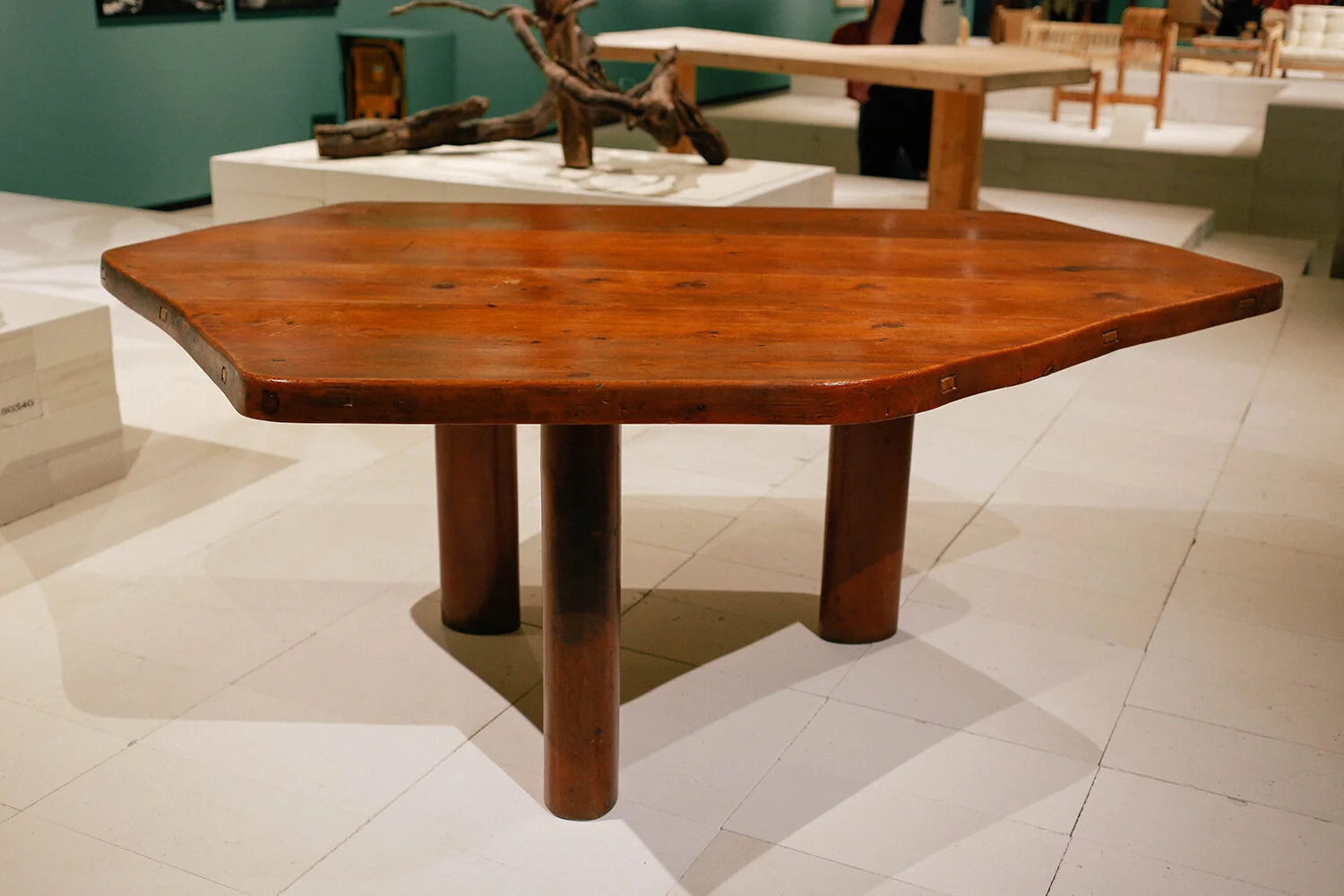
I loved this picture from Perriand’s studio in Montparnasse. It just looks so damn cosy. Towards the late 1930’s she turned away from metal manufacturing and started working almost exclusively with wood. She designed the table in that shape as it let you seat more people comfortably than you could do with a rectangular or square table. So clever. Perriand was also very sporty Spice, hence the still rings in the ceiling.

new_perri-3_1500.jpg

An example of the table in the exhibition, clearly showing how the design of the table legs meant that they weren’t in the way of guests’ legs (I hate when you have to sit with your legs around table legs).

perri-8_1500.jpg

During WW2 she was invited to go and work in Japan, and on the ship on the way over there she spotted this chalk graffiti on the deck, drawn by a Japanese sailor, which impressed her so much…

perri-9_1500.jpg

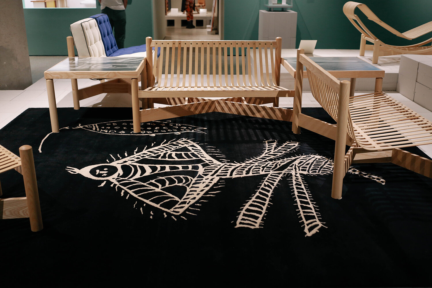
… that she copied it and enlarged it onto a rug design. As you can see here, her furniture designs had taken on a much more organic form by the early 1940’s.

perri-10_1500.jpg

Love this picture of her messing about.

perri-12_1500.jpg

Some very cool wall lights that you could pivot the angle on. They gave off such a nice light.

perri-11_1500.jpg

And this chair! Wouldn't mind having a couple of them in the house (I wish 💸).

perri-13_1500.jpg

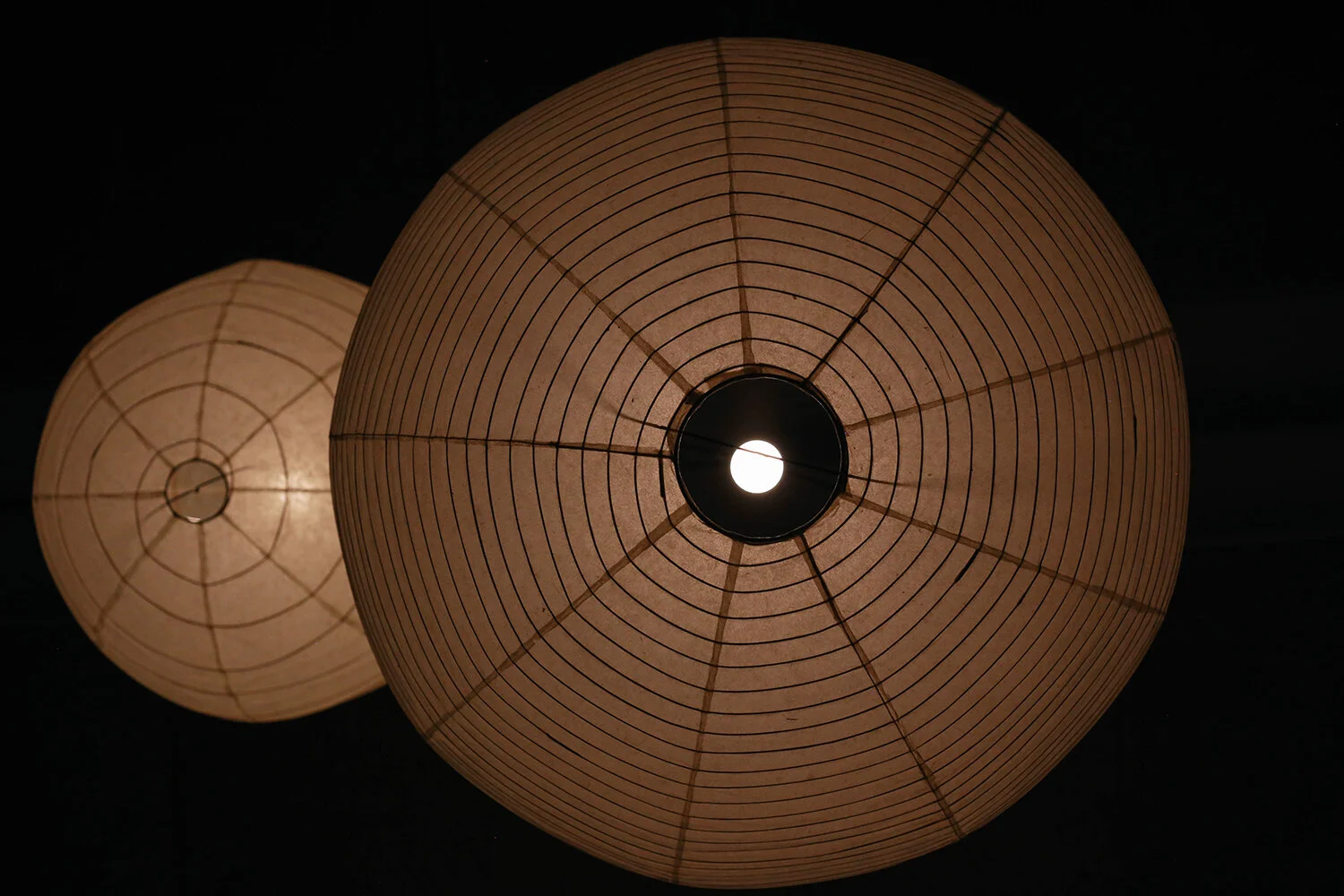
Some Isamu Noguchi rice lamps - from below. Very much looking forward to seeing his exhibition at the Barbican this autumn.

perri-14_1500.jpg

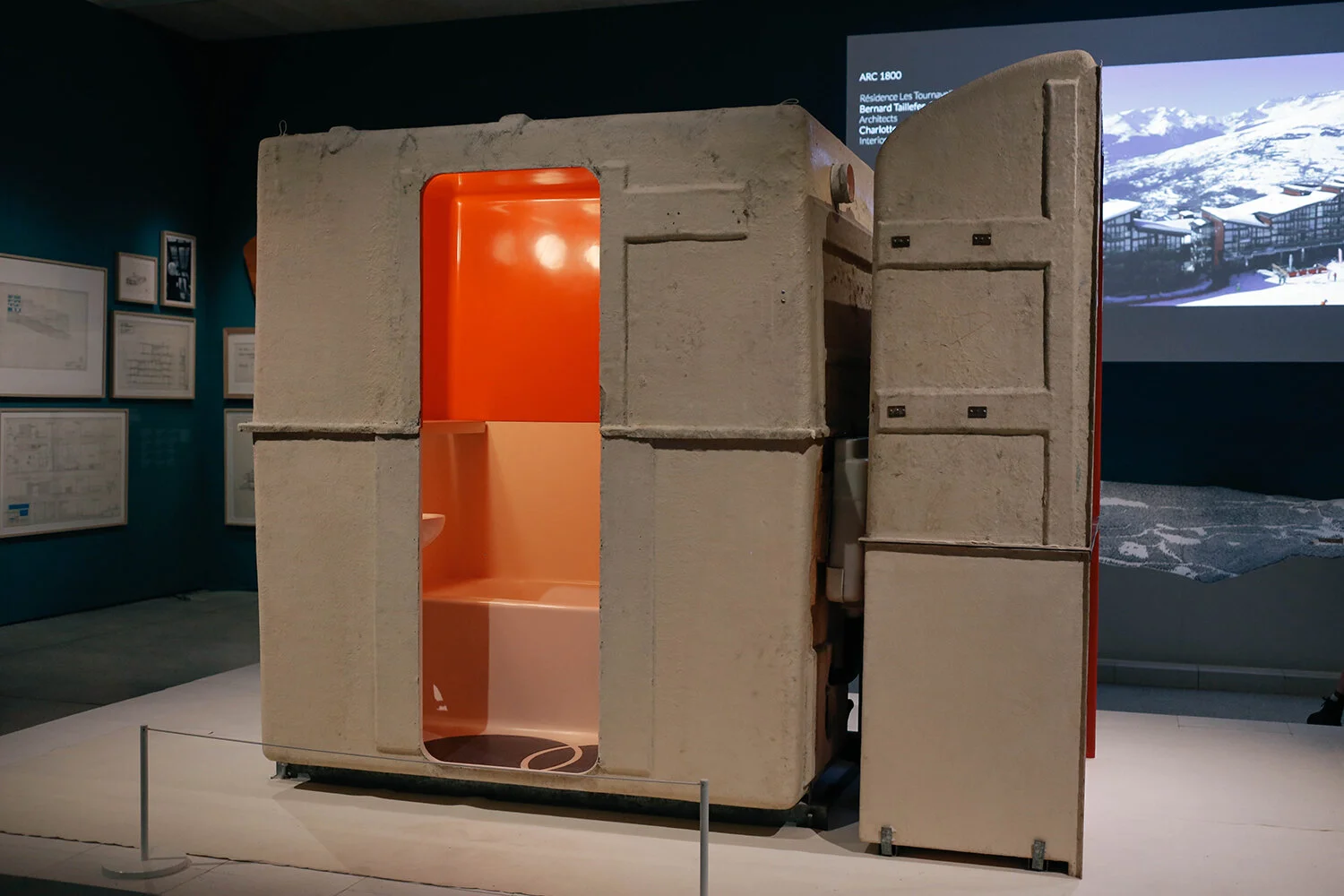
Looking at my pictures now, I realise I skipped so much as I wasn't intending to take pictures of everything to show what was there - here. I just took pics of what I liked the look of. So apologies for an abbreviated representation of all of this. So what is this you may wonder? Well, Perriand designed the ski resorts of Les Arcs 1600, 1800, 1950 and 2000 in the late 1960’s and 70’s. She had the kitchen and bathrooms prefabricated off site, so that they could be craned into position with all the electrics and plumbing all ready to be plugged in. Here’s the kitchen section

perri-15_1500.jpg

and here you can see the bathroom part in it’s own box. I found this film on YouTube that explains a bit more.

Charlotte Perriand was a genius designer and architect, and by the looks of things a great human being too. In her later years she built herself a small chalet in Meribel, and it was my favourite of all the things she created. There were only photographs of it in the exhibition, but have a look here and you’ll see what I mean. So happy we got to find out more about her and her work; I resent how history has always airbrushed women out if it, unless they were royals. Stupid frickin’ patriarchy.

Among the trees

cardboard_1500.jpg

Flashback exhibition time! Took the Oomster to see the Among the Trees exhibition at the Hayward Gallery back in August last year, where the linking theme between all the artworks was trees. As you entered you were met by this amazing diorama-type installation made out of cardboard. In hindsight I wish I’d spent longer looking at this, but with social distancing rules and a son that walks through exhibitions faster than I do, there wasn’t much time for taking my time, haha.

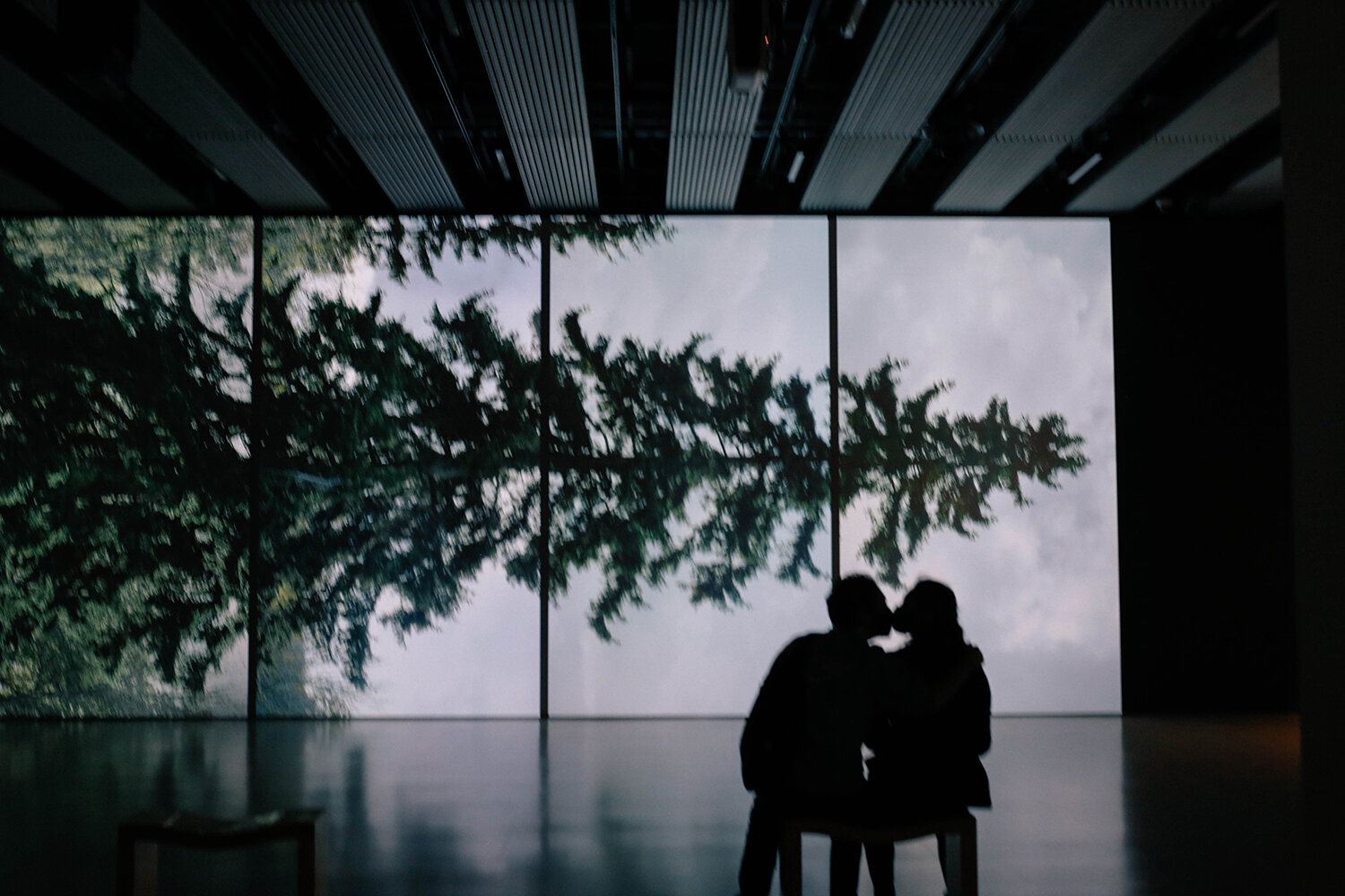
kiss_1500.jpg

You know how I’m drawn to silhouettes, right? I spotted this silhouetted couple in front of Eija-Liisa Ahtila’s filmed spruce portrait, and somehow instinctively knew that they would kiss - even though they were wearing face masks. In my excitement of watching it happen and getting ready to take the picture, I managed to wobble the camera. After it happened I took another picture - this time pin sharp, but of course, no face mask kiss. It has made me think of how unaccepting we’ve become of less than perfect pictures in the digital age; if I had shot this on film I would’ve been really pleased to have caught it at all (with the right exposure too - wow!). Pre-digital photography, less than perfect images were part of the visual language, and now they’ve been erased for ever. So, rather than posting the sharp photo I’m posting this as a reminder that as life definitely isn’t perfect, photographs needn’t be either.

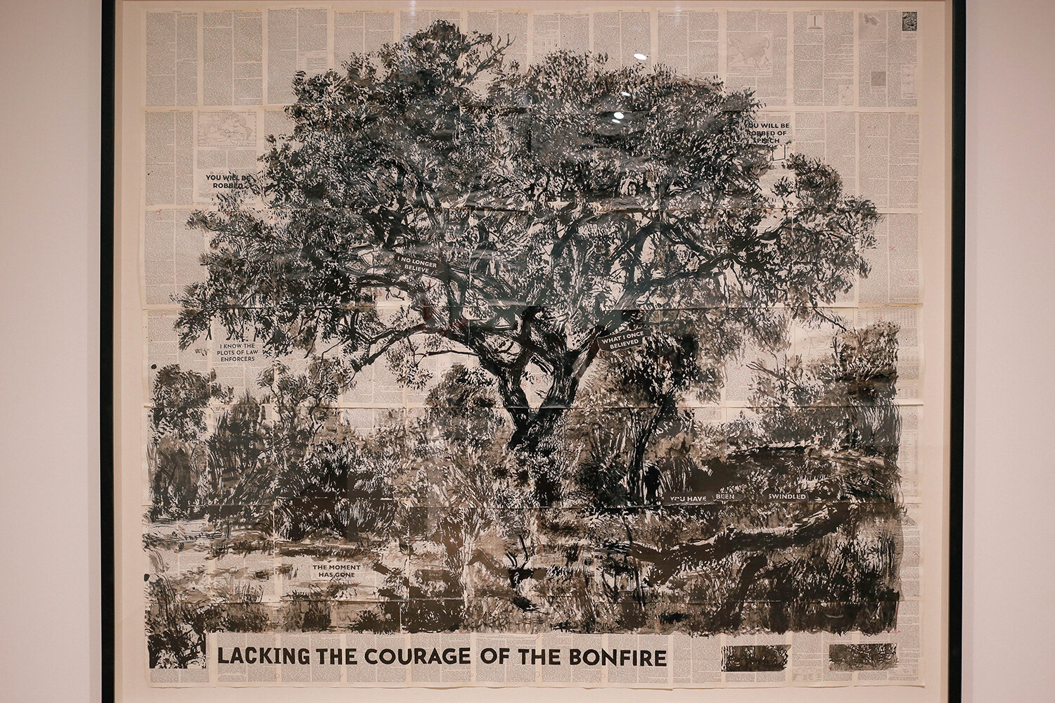
bonfire_1500.jpg

I won’t be able to give you all the background info or tell you who made what, so you’re just going to have to take these at face value, and just go with the tree theme of all of them. This was my favourite and my take-home piece. Big it was too.

jungle_1500.jpg

Loved the colours in this one.

type_tree_1500.jpg

And this tree, made out of typewriter type and sheets of paper put together was pretty impressive.

type_tree_closer_1500.jpg

Cool, right?

treeish_1500.jpg

These wooden posts had been carved back into trees. Bloody brilliant.

window_1500.jpg

And this photo ticked many boxes for me. Tree, window, each window pane a picture frame? Noice.

red_1500.jpg

These little guys were such a bright matt red. My VSCO filter choice here doesn’t do them any justice at all.

fog_box_1500.jpg

A foggy forest in a box?! Yes please. Makes me wonder where all the foggy winter mornings have gone. Is that just a December thing - and very passé by February?

white_tree_1500.jpg

Check out the Oomster. Such a dude now.

rings_1500.jpg

If this was a tree how old would it be? Very. Is this picture out of focus? I can’t tell on my screen. If it is I did it on purpose. Ha. Ha.

rings_closer_1500.jpg

Let’s go in closer. Hand drawn directly on the wall?! Very cool.

black_1500.jpg

I really liked this painting, painted solely by making textures. In fact, this is the one I’d like to have as my take home piece now, thank you please.

fire_1500.jpg

This installation, glowing like a forest fire had just passed through, was Oomoo’s fave. I wince when I think of how this is what our/his future looks like, becoming more widely spread than it is now I mean. Considering life is such a shit show right now due to you-know-what, it feels a bit too intense to think of the massive turd fest that we’ve created that is hanging over the world, forgotten about for the moment, but still very much there. But I’m hopeful, as seeing how quickly science has reacted to Covid, and how we’ve basically all accepted to more or less stay at home for nearly a year to do our bit to help, fighting climate change should be doable in time we have left to avert most of it, and should be far less painful than 2020/21 has been.

trunk_1500.jpg

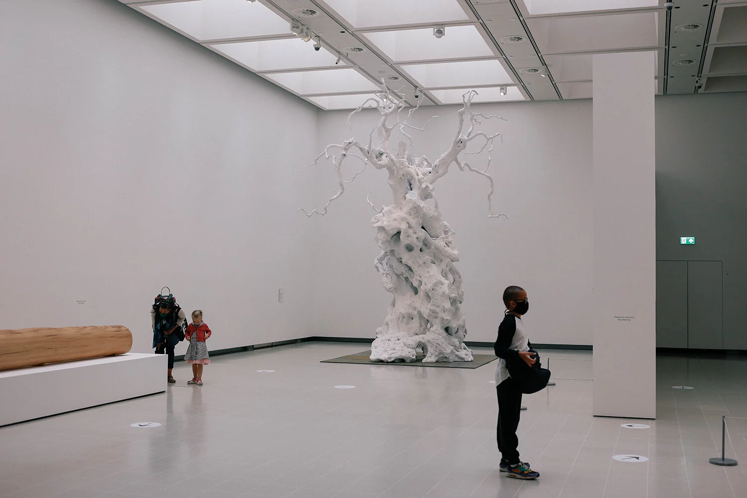
Didn't mean to get all serious like that - soz. But you can’t really go to an exhibition about trees without thinking of the environment, innit. Anyway. This tree trunk had been sliced through like pages of a book. You can see it more at the top of the trunk in this picture.

rubbish_1500.jpg

I wonder what the world would have been like had plastic not been invented? We kind of managed ok without it before, right? Hmmmmmm.

So there you have it, a bit of art for you, from the in-between-lockdown-times in 2020. I also want to share a link to the Mauritshaus Museum in the Hague today, where you can walk around virtually in the world’s first online giga pixel museum. For the past week I’ve dipped in and out walking around it (want to eke it out so it lasts longer), and it’s been mind blowing to be able to zoom in such detail on the paintings. To see the actual brush strokes of Vermeer’s Girl with a Pearl Earring, and the cracks in the paint up close is quite something. It’s felt like the best kind of food for my soul in these endless dark and grey days that’s been hitting us more often than I think is necessary. Like, we get it weather gods - enough already.