Summer in winter
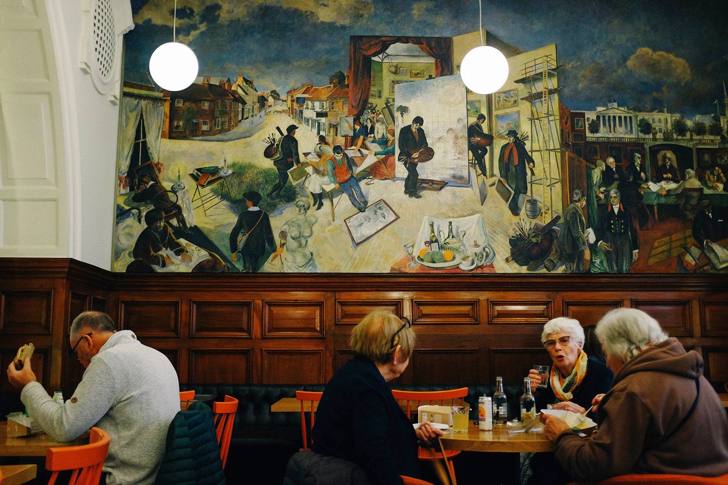
I don’t know about you, but looking at art is like medicine for me, so after being ill, the first thing I wanted to do was dose myself up on other people’s creativity. Last Tuesday morning I sat down and looked at what was on, and wrote down a list of 15 (!) exhibitions I wanted to go to. After having established the date order of when to go, I headed into town to see Mixing It Up at the Hayward Gallery. Just as I was mere meters away I thought: “Wait, isn’t the Hayward shut on Tuesdays?!” only to see that it was. I put it down to my post-Covid brain not remembering to check whether they were open or not. My other genius move was that I’d left my list at home, but I remembered what was no. 2: The Summer Exhibition at the Royal Academy. So, back across the river I walked, arriving at the RA by lunch time and going straight to the café. There I sat, eating my sandwich, facing this mural by Gilbert Spencer called An Artist’s Progress, painted in 1959. Apparently it wasn't very popular at the time, and one critic called it “The worst picture of the year!.” Ouch. I however enjoyed looking at it and following the story, and how it made a good backdrop for the lunching ladies. Re-energised and rested, I went upstairs to embark on the marathon awaiting me; the Summer Exhibition contains over a 1000 artworks. I took a lot of pictures, and I’m going to post 45 of them here. “45 pictures in one post?! Are you mad?!!” I hear you say. Well, I thought it fitting, as walking through the exhibition itself is quite an undertaking. So, make yourself comfortable (maybe boil that kettle), ‘cause here goes.

Mexican Man With Green And Red Spotted Shirt Bill Traylor £96,500
The annual Summer Exhibition has been on every year at the Royal Academy since 1769, and for the past couple of years it’s been held in late autumn/early winter because of the pandemic. It has never been cancelled, not even during the world wars. Each exhibition is co-ordinated by a Royal Academician, and this year’s selection was over seen by Yinka Shonibare. The title of it is Reclaiming Magic, and Bill Traylor’s art worked as a catalyst of what the theme should be. From the guide book of the exhibition: “We begin our journey with the work of one artist, Bill Traylor, from whom the kaleidoscope of ideas in the exhibition has evolved. Born into slavery in 1854, he did not start making art until the age of 85. He was a self-taught artist and has come into prominence in our time as society has shifted its values. Bill Traylor’s work singularly inspired the idea of looking beyond the boundaries of Western art history.”

Red Man With Pipe
Bill Traylor £71,500

Lamp, Abstract Table, Figures And Dog
Bill Traylor £89,500
Now, if you’re a long time reader of the blog (cast your mind back to the heady days of blogging in 2008 if so), you might remember that I got given a book about him, which blew my mind, so to see his work IRL was incredible. I had no idea he was included, so it was a pleasant surprise, and I spent a long time looking at them, with my heart beating a bit faster.
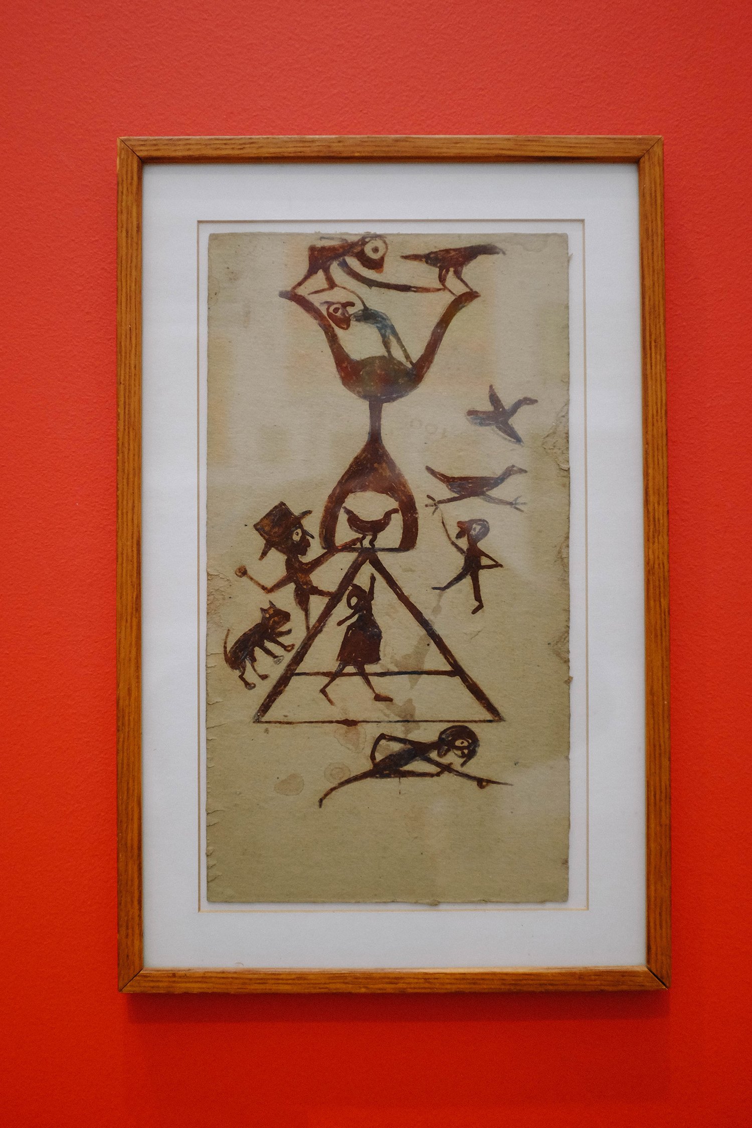
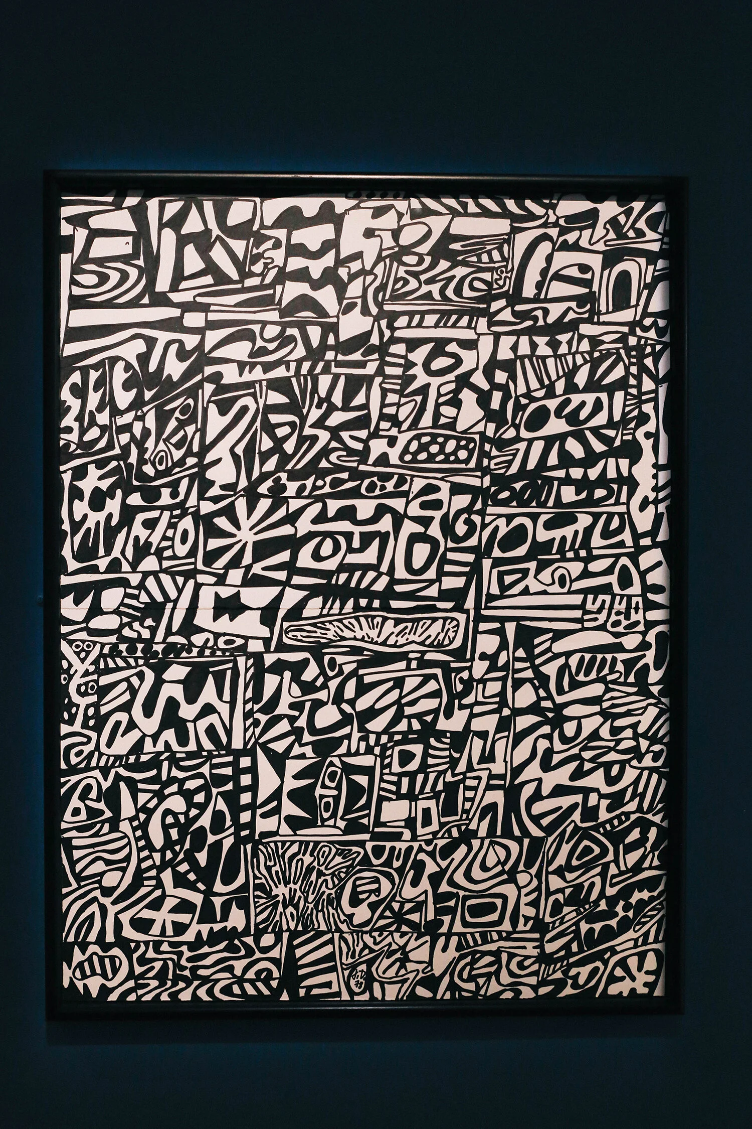
Untitled (Construction With Figures) Bill Traylor NSF (not for sale)
Almost all of the work at the Summer Exhibition is for sale, and had I been a millionaire I might have considered Red Man With Pipe (see above above - ha!), a mere snip at £71,500.

Right then, let’s move on. The fun thing about the SE is that the works on display is a mixture of works from established, new or amateur artists and members of the public. Anyone can enter.

The Musician Joy Yamusage £9,500
I didn’t shoot this with anything to give it scale, but it was huge - and cool.

Prison Culture: Canteen II by Lee Cutter £3,200
I saw some of Lee Cutters’ carved soaps at the 2018 SE. They are really something.

George Floyd Remembered Ian Wright £650
It has never occurred to me that you could do actual portraits with Hama beads.
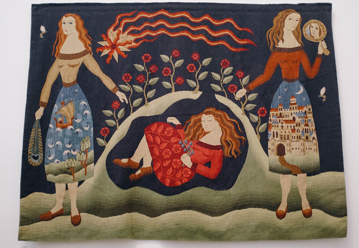
Memento Mori Chrissie Freeth NFS (not for sale)
There’s no doubt I’m middle aged now, as I keep finding that my taste is changing. I now love tapestries, I can listen to opera without wanting to turn it off and I’ve also come round to watercolour paintings. I used to think they were so naff, and now I love how delicate they are. Anyway, I digress. I found the craftsmanship in this amazing.
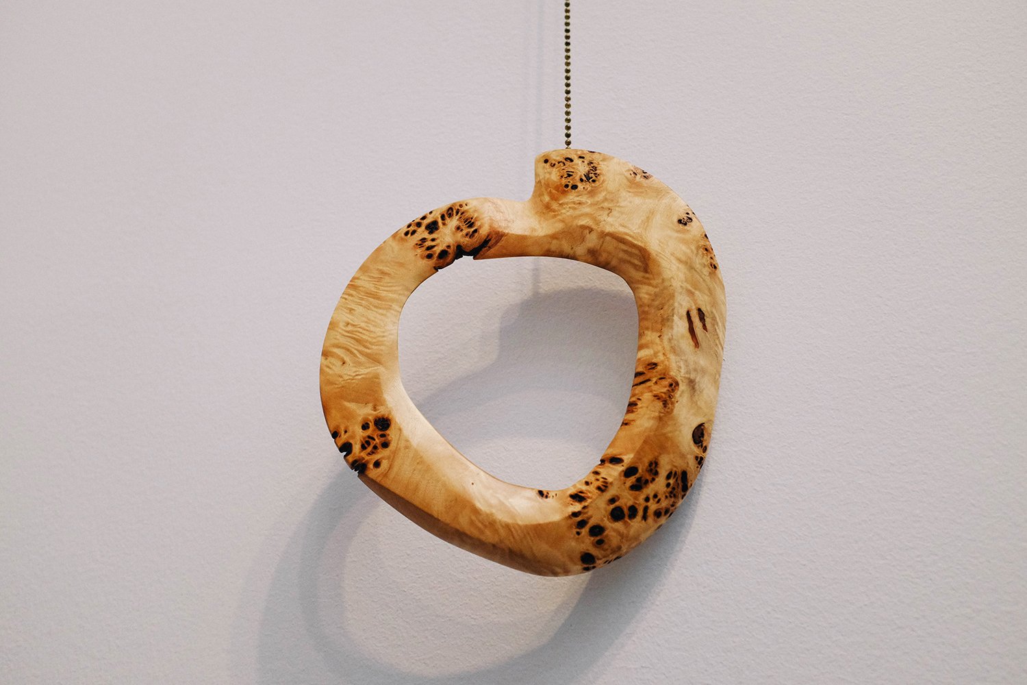
Pull Max Frommeld £2,000
Now how’s this for a fancy light pull? It’s actually quite large, maybe about 25cm in diameter. It would be so beautiful hanging in the window of a minimalist house.
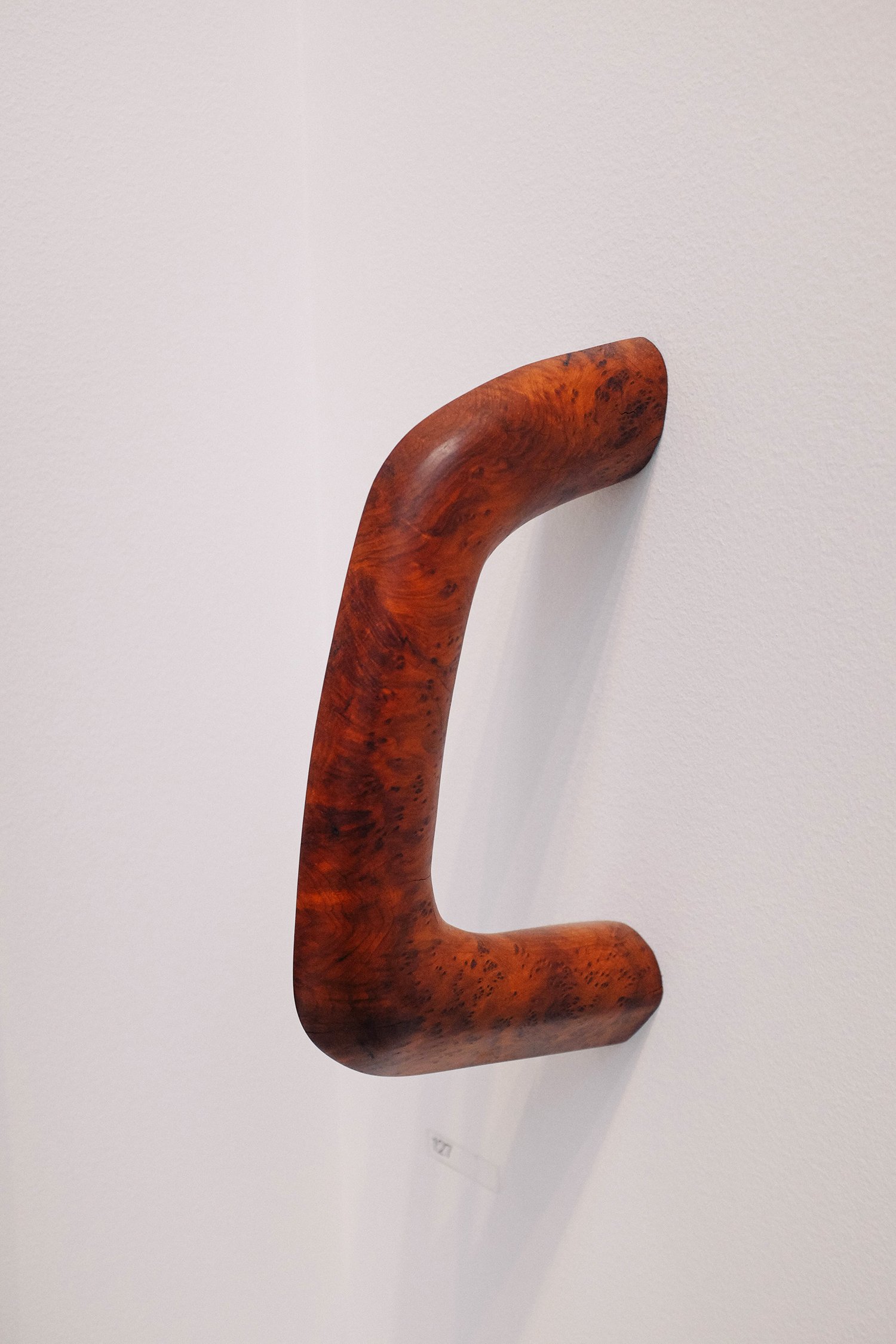
Hold Max Frommeld £2,800
As would this handle type thing (see, I know all the art critic lingo). I reeaaaaally liked this. I’d love it just jutting out on a wall somewhere random at home. But obviously not in the loo, as that would be beyond middle age.
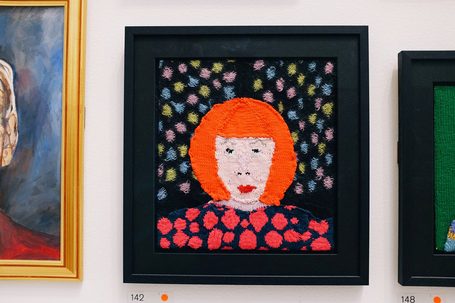
Yayoi Kusama Rod Melvin £1,025
Pretty obvious who this is, eh? Also, knitted portraits! Totally deserves an exclamation mark.
Red Robin Harry Hill £50
Harry Hill is a British (very British) stand up comedian, who’s very silly and has made us laugh a lot over the years. He’s also a bit of an amateur artist on the side, and this was one of his entries. You can see him talk about it here.

Renovation of the Headquarters of the Royal Geographical Society, Kensington Gore
Adam Caruso and Peter St John RA (Royal Academician) £360
I’ve always found the architecture room at the SE quite boring, but this year was different, as I’ve become much more interested in architecture since Covid and my lockdown looking-at-buildings walks. £360 isn’t a huge amount of money for something as nice as this, but I don’t have that sort of spare cash. A photo of the print will have to do.

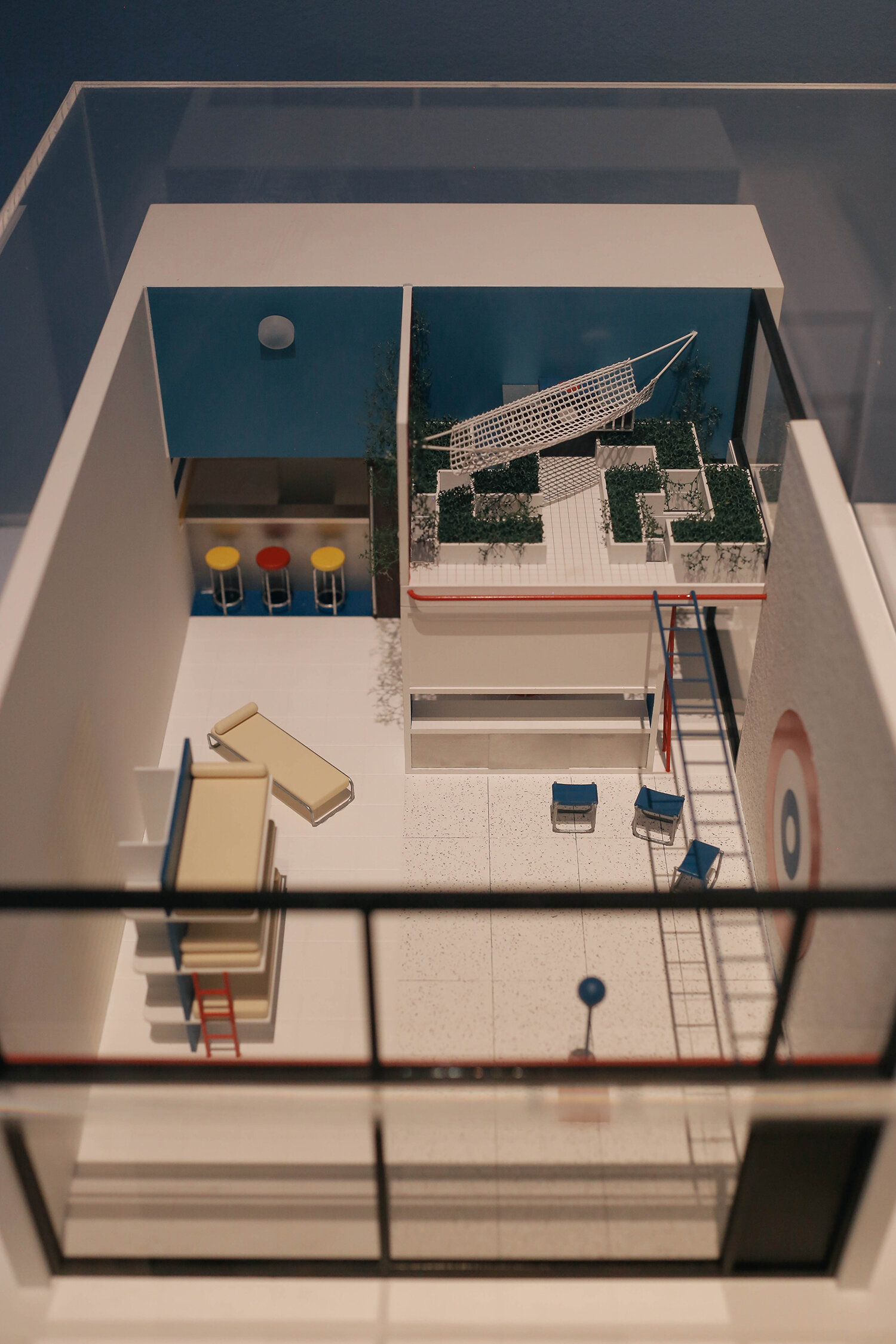
UCL East Marshgate - Study Model 1:100 Stanton Williams NFS
I know for sure that in another life, Mr Famapa would have been a model maker. He’d be awesome at it.

It wasn’t madly busy, which was nice. I love the quiet in a gallery/museum on a weekday, with the chance to step away from the world outside, especially now as town is all Christmassy and busy.

Chibok Girls: Nigeria’s Stolen Daughters Julienne Hanson £750
Went in a bit closer on this, so you can see it more in detail. Another very large knitted piece.

Another wide shot so you can see how much there is on the walls, and also how high up some of it is. I’d be a pit peeved if that was my picture on top of the throughway like that, wouldn’t you?

6 Works From the Vocabulary Series Marlene Dumas Hon RA NFS
I love Marlene Dumas’ work. Talk about cool watercolours. Her stuff is so otherworldly. She’s got a big exhibition in Venice next year. I might send myself over there in the post so I can see it.

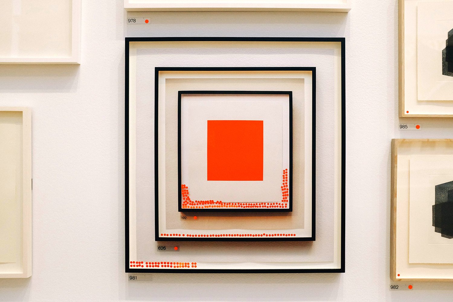
Verde Ana Ayesta £1,000
See number 284? The minimalist green and black piece. Gutted that it was hanging so high up. I really liked the look of it, but struggled to see it properly, and the reflections didn't help either. Shame.

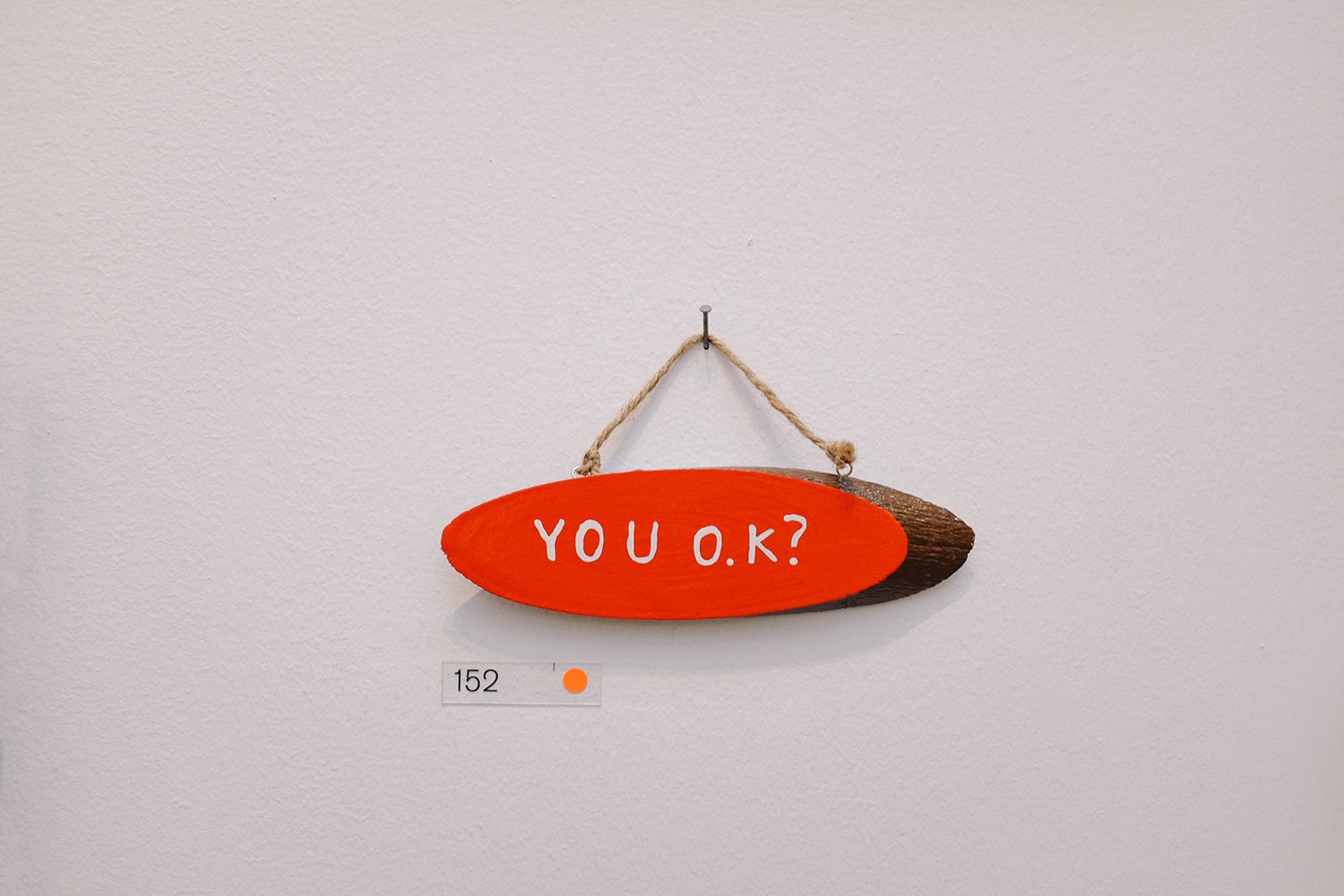
Sleep Well Heidrun Rathgeb £330
Looooooved this wood cut. Another one I would’ve bought with my Monopoly money.

Ada Set Of Stairs 40.11 Wolgang Tillmans RA £108,960
This massive inkjet print really stood out. I was wondering how you can even print something that big, and then when I saw that it was by Wolfgang Tillmans, and I understood that if you’re Wolfgang Tillmans you can. I overheard these two ladies saying that they found it a bit scary, as if it was about to fall down on them. I kind of know what they mean.

Tried to get a shot of this lady with her hat and colour combo, but she moved just as I took the picture.

The Business Of Hanging Around Terry Wood £14,750
Liked the contrast of the clean painting floating in the air and the ornate moulding in the ceiling.

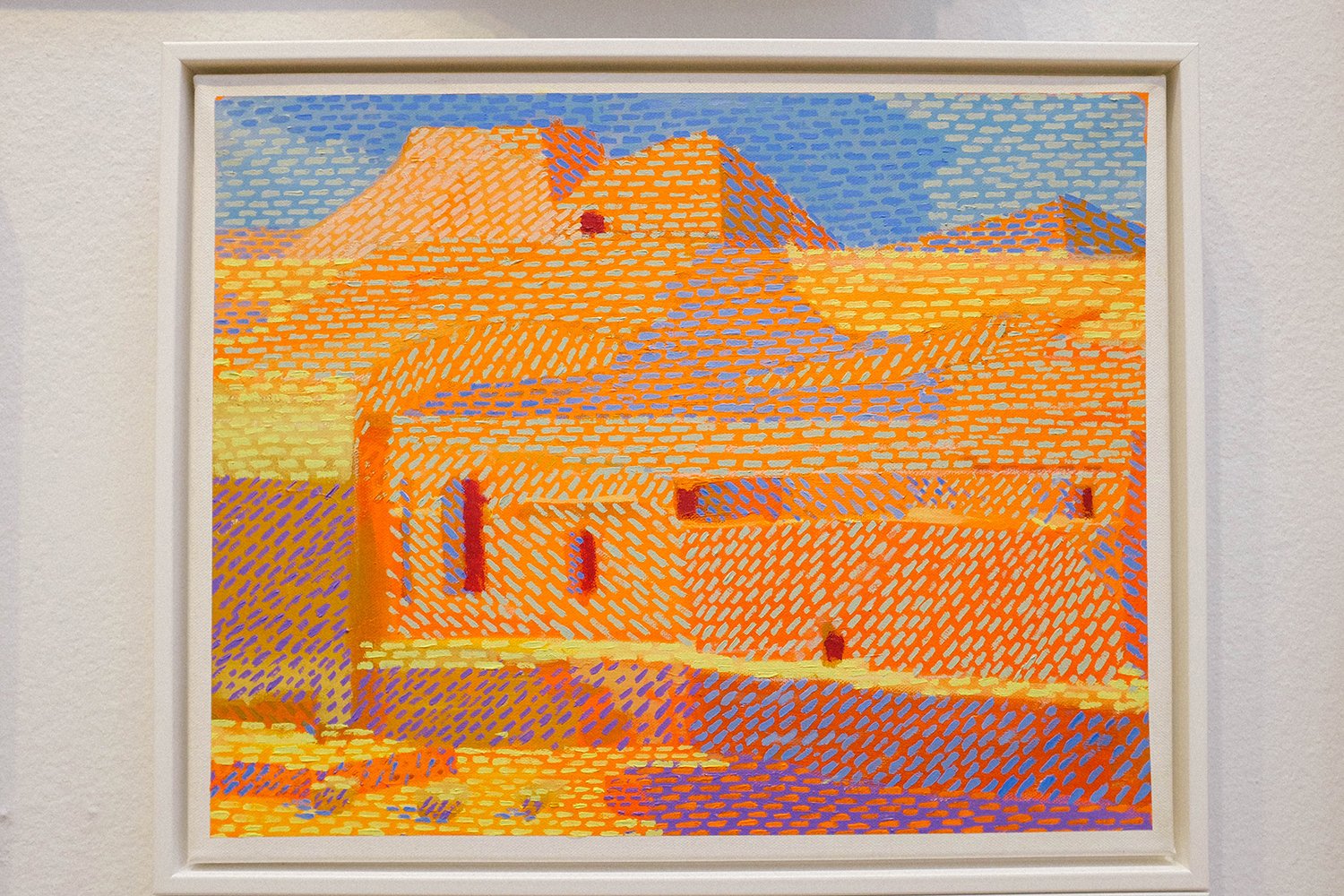
Back Of Wendover, The Aylesbury Fragments Harriet Mena Hill £1,350
Who’s to say that you can’t paint on bits of salvaged concrete?

Amnesiac Beach Fire (Mod II) Mike Nelson RA £15,000
Or make a fire in the corner?

Our Visit To The Contemporary Art Museum Did Not Go Entirely As Planned Glen Baxter £6,800
This made me smile and think of Gary Larson.
Troglodytes Of The Northern Desert Stephen Farthing RA £8,000
Looking at this really messed with my eyes. Some colours put next to makes our brains very confused. This painting was like an afterimage.

End Of The Night Class Gutsche £390
Another one that I would’ve bought. It really reminded me of summer nights in the Swedish countryside. Must be the pine trees.

Stardust Eileen Cooper RA £1,150/£900
There were quite a few Eileen Cooper artworks in the there (I guess one of the many perks of being a Royal Academician is that you can enter as many artworks as you want) but this one was my fave.

Changeling 001 Brett Walker £390/290
See the half cat half human portrait? Loooooooove it.
Seeing Red (Again) Corneila Parker RA £666
This made me smile so much. I think this might be the third version of this concept from Corneila Parker, but she could just run with this forever and ever. It’s a dead cert to get chosen every year, but then she would be anyway, because the lady is a genius. You can read more about the first version Stolen Thunder (Red Spot) here.

Matrix IV, From: Aquatints Antony Gormley RA £2,400
Focus!

Ahhh, that’s better. I really enjoyed the times where I immediately felt something; either instantly liking it or recognising who the art was by, before looking in the List of Works guidebook to check the artist. This was one of those occasions where I instantly liked it. When I read that it was by Antony Gormley it made perfect sense - I love everything he does.

Sin - Without Ed Ruscha HON RA
And this was one of those times when I knew who’d made it straight away - Ed Ruscha (kind of obvious I guess, haha).

So Long And Thanks For All The FIsh Derek Curtis £2,500
See the little painting on its own above the doorway? How aptly placed. Just that bit away from everyone else. Stupid effin’ Brexit. I hate it.
Chris Whitty’s Cat Grayson Perry RA NFS
I don’t hate this though. Such pleasure to also see this in real life, as I watched this being made in one of the Grayson’s Art Club episodes last year. In the first lockdown, broadcast on Channel 4 in weekly instalments, Grayson Perry started an art club, with weekly themes that members of the public could partake in, and send him their art. The end result is an exhibition of lockdown art that is currently travelling the country. There were so many good things on TV to keep us sane in those many months of isolation, but Perry’s show was probably the best.
A Little Bit Of InfinityB/C/F Peter Randall-Page RA £4,000 each
Noice noice. Really liking the complex simplicity of these. Whoa, I’m hitting the wall dudes. Are you? This is a flipping monster of a post. Are you still with me? Or are you scrolling going “Next. Next.”? Don’t tell me, as it’s easier for me to pretend that you find all of this interesting, because I’ve spent HOURS doing this post. We’re nearly there guys, only six more pics to go. We can DO IT.

Exodus Zak Ové £43,200
This was a very popular piece, with a lot of nostalgic men looking at it. Made it impossible to get a clean shot of it without anyone in it.

Pool 1 Christine Haig £480/280
So beautiful this, isn’t it? One thing I think I figured out is that if you’re submitting photographs to the SE, they must be very clean graphically. More like something that you put in your house because it goes well with the interior, rather than it being a good picture (not the case here though, but it falls in that bracket too). I think it’s a bit unfair, as so many of the other art works are really busy, and a thing within itself. It could also be that the photographs that get in are like this because they have to compete with busy paintings and the like, and it’s the only way they’ll stand out. They can’t all be huge like Wolfgang Tillmans’ print (which, hello, was very clean graphically!). I’d love to see what the photos that don’t make it in are like. Are they better photographs? Or is this kind of photography the only kind being submitted? Or does the photographer think about how they can easily sell their work? And actually, I’m equally guilty of thinking of the art in the exhibition in relation to what would look like in my house. I guess it can’t be helped, as if you’re buying art, it’s generally going up on a wall, in a home. Still, I think it’s interesting that there’s such a clear division between photography and the other art forms on display here, but I realise that I’m being hypocritical, seeing as all the pieces I’ve taken pictures of and have posted here, fall in the bracket “clean graphically”. “But I used to be a graphic designer” she whispers. “So I can’t actually help it. It’s deeply embedded in my visual DNA”. Pffffft.
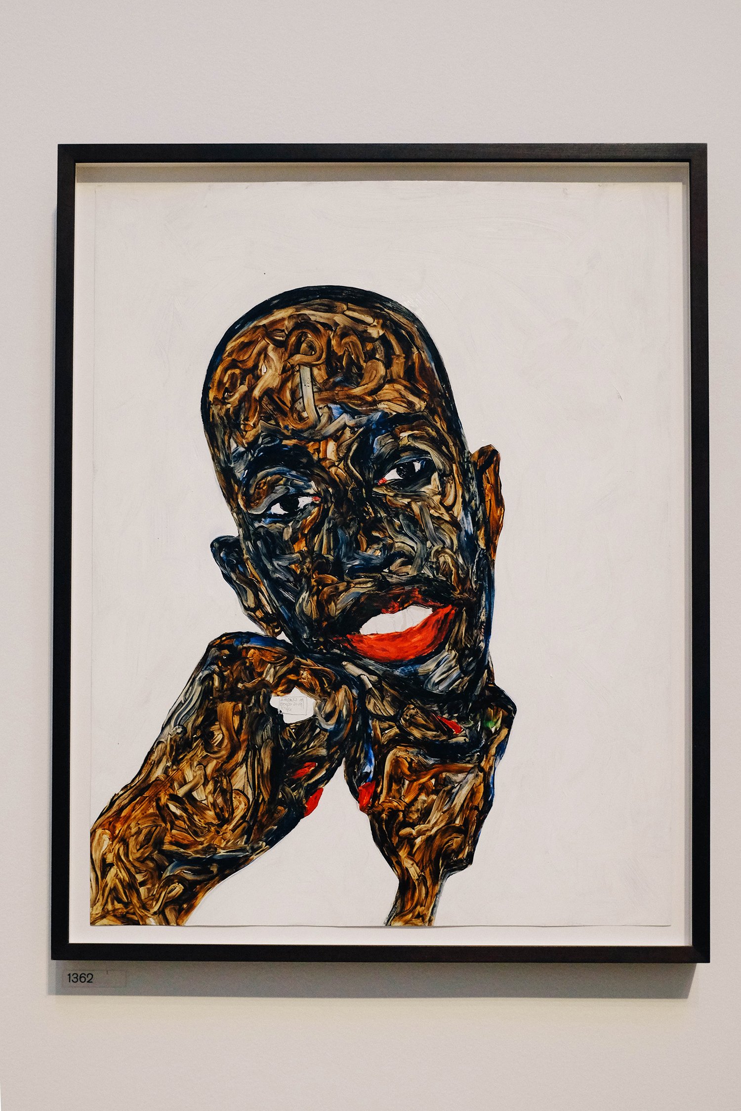
Fatou Amoalko Boafo (Private Collection) NFS
I guess it’s harder for photographs to “compete” when there’s such great things around them like this painting for example. I’m sure if I had a go at finger painting it would not turn out like this.

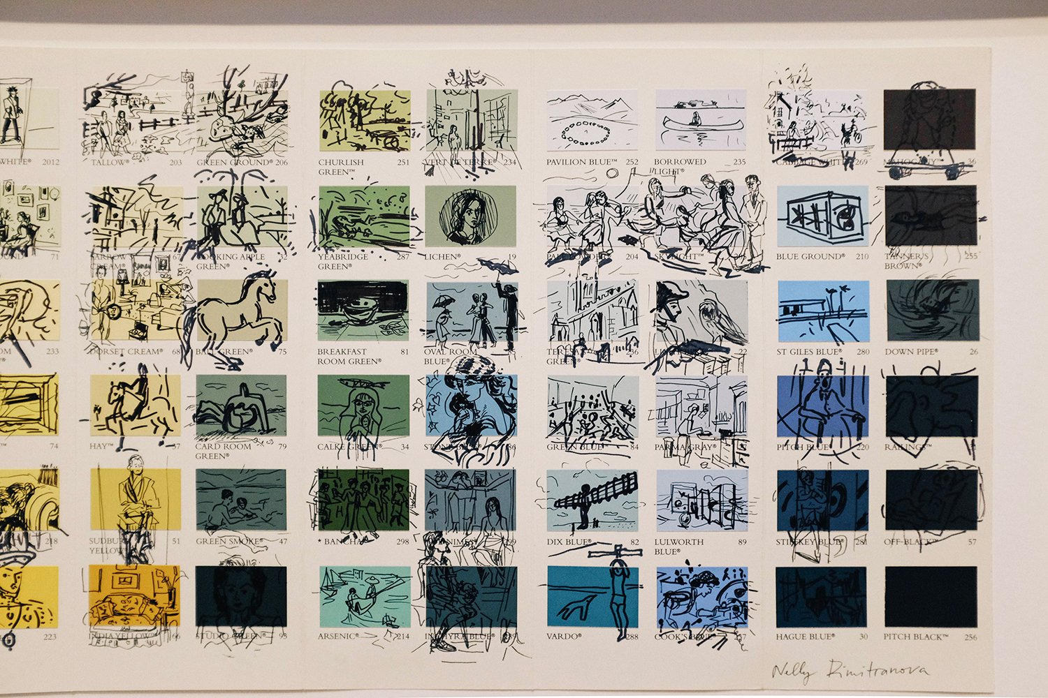
Experiencing British Art History Nelly Dimitranova £3,500
OMG. This. This is epic. First it made me laugh as I know this colour chart from Farrow & Ball very well, but then my jaw kind of dropped when I looked closer at each paint chip. Every one of them a drawing of a famous British painting or sculpture. I mean, everyone is in there, honestly. If you take your time, I’m sure you’ll recognise loads of them. I recommend coming back to this and looking at them all properly, as I completely get that you might just have OD’d on all of this by now.

I did tell you. The Summer Exhibition is a real undertaking. So is a blog post with 45 pictures.
But we’ve finally made it to the end. If I find out you just scrolled through it all, I’m going to come and pinch you. And I’ll take a picture of me doing it, and then I’ll enter it to next year’s Summer Exhibition. Boom.